For those of you who have been reading my blog for a while, you may have noticed that I recently changed my template. This is a Blogger blog, and when I originally set up my Blogger account I was in a hurry to do so and simply selected one of the available templates. However, I’ve never been quite satisfied with its accessibility. So, after 15 months with this task on my back burner, I finally got around to creating a custom template that improves accessibility. Here’s how:
Change from Fixed to Liquid Layout
The original design used a fixed width, set at 740px. This is a common approach to layout and actually demonstrates sensitivity to those who have lower resolution monitors. A higher width would cause users with 780px-wide screens to have to scroll horizontally. However, for users with higher resolutions this design presented a lot of wasted space, and resulted in the feeling of content being squished in the center of the screen.
To improve this, I modified the style sheet so that it now has a liquid layout, and therefore scales well. The content fills 75% of the screen width for all users regardless of resolution or window size, and the sidebar floats right and occupies 23% of the width of the content.
Larger Font Size
The default font size in the original design was too small. In fact, the original style defined font-size on the body as x-small, and various child elements had font-size values that were smaller still (85% of x-small is very small indeed!) Oh sure – users can increase font size on-the-fly with Ctrl + in most Windows browsers, and ⌘ + in most Mac browsers, but all users shouldn’t have to do that, and some users aren’t aware that it’s possible.
My approach to all my sites is to set the default font-size on the body element to 1em. That’s the size of the letter “m” in the user’s default font setting within their browser, and therefore honors users’ preferences, assuming they know how to change the font size in their browser. If they don’t know how to do this, then using the default size at least honors users’ expectations.
More Color Contrast
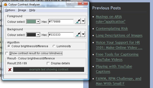
Several areas of the page had insufficient color contrast, particularly for visited links in the sidebar. As shown in the following screen shot, a quick check of suspect content with the WAT-C Colour Contrast Analyser revealed foreground/background color differences that were well below those required even for minimum conformance to the Web Content Accessibility Guidelines 2.0.
This problem has been addressed throughout the new design. The main content now uses black text on a white background, and the sidebar uses white text on various darker backgrounds. I don’t personally find this any less aesthetically pleasing, and it’s a heck of a lot easier for all users to see.
Visible Focus for Keyboard Users
The original design had a few hover effects, where links would change color and/or background color as users hovered over them with the mouse. This was done in CSS like so:
color: #000;
}
However, :hover only results in this effect for mouse users, and it’s arguably even more important for keyboard users (e.g., sighted users with upper mobility impairments, unable to use the mouse but navigating by pressing the tab key). Keyboard users can very easily loose their place on the page unless there are clearly visible navigation queues to show their current focus. This is a simple fix, involving the addition of a couple of pseudo-class selectors to the existing CSS definition:
color: #000;
}
In a perfect world, all we would need to add is a:focus, which according to the CSS2 spec is supposed to apply while an element has focus. However, Internet Explorer doesn’t support this, not even in IE8, but it does support :active so the latter is added as an IE workaround.
Add ARIA landmark roles
As described in my previous blog post, the W3C Accessible Rich Internet Applications 1.0 specification (ARIA) introduces the role attribute, including seven so-called landmark roles that identify specific sections that commonly appear on web pages. Landmark roles allow screen reader users (and eventually all users, once browsers build in support) to quickly jump to specific sections of the page using a single keystroke. For example, users of JAWS 10 and higher can navigate forward through landmarks by pressing semicolon, and backward by pressing shift + semicolon, or they can generate a list of landmarks by pressing Ins + Ctrl + semicolon. My blog template now includes landmark roles that identify the “header”, “search”, “main”, and “contentinfo” (footer) sections of the page. There are also multiple “navigation” landmarks (one each for Previous Posts, Archives, and Links) and a “complementary” landmark for the Twitter Tweets box.
Say No to CAPTCHA
I removed the CAPTCHA requirement (I actually did this early on, but it’s worth mentioning here). In Blogger, under Settings > “Show word verification for comments”, I selected “No”. If “Yes” is selected, users must solve a CAPTCHA (those annoying images containing funky distorted characters) in order to post a comment, which would eliminate the possibility of my receiving comments from blind users or anyone else who can’t see or process the CAPTCHA. Google does have an audible alternative that accompanies its CAPTCHAs in some applications, but for some inexcusable reason they haven’t implemented that solution in Blogger. If they did, I would reconsider whether to use it or not, but would probably still select “No” because the audible CAPTCHAs are difficult to solve, and CAPTCHAs are still inaccessible to people who are deaf-blind, have cognitive disabilities, or other disabilities that affect folks’ ability to process text, especially distorted text. With CAPTCHA turned off, I may be opening myself up to SPAM, but I’m willing to assume that risk rather than slam the door on folks who want to comment on my blog posts. I have also set “Comment Moderation” to “Always” so if I do get spammed, the rest of you aren’t burdened by that. So far though, in 15 months of blogging, my comments have only been spammed twice.
Say No To the Blogger NavBar
The Blogger NavBar is placed at the top of Blogger Blogs and provides a search box as well as some other navigational features. Other than the Search box, I haven’t found the NavBar to be of any great value, plus (ironically, since this is Google), the search feature isn’t reliable.
Other than that, the biggest problem with the Blogger NavBar from my perspective is that it loads in an iframe that yields dozens of HTML validation errors. When balancing that with the benefits it provides (none for me), I had no qualms about getting rid of it. To turn off the Blogger NavBar, simply go to Template > “Edit HTML” > “Change the Blogger NavBar”, and select option “Off”.
Restore Search
Although I didn’t want the Blogger NavBar specifically, I did want search capability. Anything that makes it easier for visitors to find content is a good thing. To restore search, I created a Google Custom Search that not only searches my blog, but also my music site and my Twitter feeds, since all are closely related. Unfortunately these days the code that’s generated by Google Custom Search is entirely written in Javascript and does not allow the author to provide a fully accessible HTML form field. Fortunately I had some legacy HTML Google Custom Search code lying around from another site I had created, so I used that, and simply plugged in the new id of my custom search, which is provided by Google. Here’s the code I’m using for the search field:
<input type=”hidden” name=”ie” value=”UTF-8″/>
<label for=”searchBox”>Search Terrill’s sites:</label>
<input id=”searchBox” style=”width: 200px;” name=”q” type=”text”/>
<input id=”searchButton” value=”Search!” type=”submit”/>
</div>
</form>
</div>
One negative aspect of using Google Custom Search is that ads will display in the search results. Hopefully they’re targeted well-enough to be useful rather than annoying.
Add Beauty and Branding
I added a background color gradient. That’s mostly an aesthetic addition rather than one related to accessibility, although it does help to create some consistency with my music site, flowtheory.info, which uses the same background. As I build more sites, maybe this will become my signature background.
I also added a custom favicon.ico (previously it was the Blogger “B”), so my site now has a tiny “tt” logo that should show up on browser tabs, favorites, and other places that favicons are used. For the curious and unfamiliar, this is the code I used to do that:
<link rel=”shortcut icon” href=”http://terrillthompson.com/favicon.ico” type=”image/x-icon”/>
<link rel=”icon” href=”http://terrillthompson.com/favicon.ico” type=”image/x-icon”/>
There’s obviously a lot of redundancy here, but some browsers support different markup so the redundancy is there to satisfy them all.
It’s worth noting that the Blogger template includes the following tag:
This tag, positioned within the <head></head> section of the template, injects several <meta> elements, <link> elements, and some Javascript into the web page. This includes tags that set favicon.ico to the Blogger B, so in order to overwrite those tags, the above custom tags must be added after the <$BlogMetaData$> tag. If browsers encounter conflicting tags, they will use the last tag.
HTML Validation: Still a Problem
The page still doesn’t validate. Removing the Blogger NavBar reduced the number of validation errors from 96 to 44, and over half of the remaining errors are generated by the <$BlogMetaData$> tag. Most of these errors are related to special characters in URLs not being properly encoded (i.e., & is not encoded as &). I considered removing that Blogger tag altogether and replicating (and cleaning up) its contents directly in the template. However, this isn’t feasible since some of the content in those tags is generated programatically and is dynamic. So for now, I’m reluctantly living with the validation errors, taking some comfort in knowing that Jeffrey Zeldman’s templates (e.g., Ms. Moto) have 162 validation errors, far more than mine.
It’s worth noting that another validation error results from my including ARIA landmarks in the markup. This is a known and generally accepted problem. ARIA improves accessibility, but as of this writing is not yet an official standard and is not valid (X)HTML. There are many discussions about this, including this one on the iheni blog, as well as a workaround demonstrated by Steve Faulkner. As others have said, validation is important, but if it conflicts with users being able to access the site, the latter is arguably more important.
Suggestions?
If there’s anything I can do to improve the site further, especially its accessibility, please share your comments.
6 replies on “My New, More Accessible Blogger Template”
Very useful – thanks. I'm getting a lot of objection to using fluid styles because the line length can get too long to read easily, but I think fluid gives the user the capability of getting it exactly as readable as they need and giving them the option of tiling a couple of windows (which I'm always doing – don't know about most users, though). Any further thoughts on the possibility of long-line-length with fluid page formats?
Hi Marie,
I agree that long lines of text can be a challenge to read, and that's particularly problematic for people who already have difficulty tracking text. For that reason I typically constrain the width of the text content somewhat, but I do so using percentages so users still get the benefit of the liquid layout.
For example, on this blog, div#content (all the main content of the page) has width:80%, and div#main (the left column) has width:75%. This I think keeps the main content readable regardless of the user's screen resolution or browser window size.
Constraining the width of div#content also provides some space on either side for the gradient background, which I hope contributes positively to the aesthetic of the site and therefore isn't just wasted space.
Hello, Terrill,
I was looking for some hints how to validate blogger templates. Until recently, I have been working on one theme, which wasn't coded by me, but I managed to transform it to a blogger template.
Just a hint for validation, if you really want your page to go trough validation with as few errors as possible, it's good to use the classic templates, host the pictures on your own server (picasa etc. is also good), so you don't use the blogger hosted links, which are also malformed.
This way with a bit of effort, you can come up with a layout where you will have only one validation error which will come from google navbar (even if it's hidden, the code is still there – it's just hidden by CSS)
If you would like to check it out: Cestovatelska fotografia There is just photography related text with photo placeholders so the template isn't blank.
Regards MYSTERYouse
I really appreciate your post and you explain each and every point very well.Thanks for sharing this information.And I’ll love to read your next post too.
Wheelchairs
How do you get your blog to show up when your subject is "googled"?
@Silver one of the most helpful resources on "search engine optimization" is Google's own Search Engine Optimization Starter Guide. Not surprisingly, many of its tips are consistent with accessibility guidelines.