In 2020, COVID-19 upended society in countless ways, including the cancelling of the annual NCAA Men’s Basketball Tournament. This meant cancelling my annual Accessible Tournament Bracket and pool, which is something I always look forward to.
Fast forward to May. I’m giving a presentation at the HighEdWeb Accessibility Summit on Accessible Navigation Menus, based in part on lessons learned as I’ve explored this issue over the years, as documented in my previous blog post. Long story short: There’s a lot of confusion and debate over how best to code a website navigation menu.
In preparation for my presentation, I found myself wondering what the current state is among higher education institutions. Jared Smith provided me with some data from the WebAIM One Million:
- There are 5903 home pages in their sample with .edu domains
- 4656 had at least one <nav> (79%)
- 859 had at least one ARIA menu (14.5%)
- There are 7,277 ARIA menus in all (an average of 8.5 per page on the pages that have them)
- 2,620 of ARIA menus (36%) were broken (i.e., did not have the required components)
The relatively high use of <nav> is promising. But the high use of ARIA menus (several per page) suggests they aren’t being used properly, and the fact that so many are broken is especially disconcerting, but not surprising.
This data just left me hungry for a deeper understanding of what’s actually happening out there on higher education home pages. Combined with my lingering sadness over missing March Madness, I decided on a whim last night to stage my own NCAA Tournament, and advance teams in the bracket based on accessibility of their website navigation menus. I devoted many long hours to this endeavor. It’s a weekend, so I stayed up until midnight last night staging the play-in games and first two rounds, then woke up early this morning eager to get on with the Sweet Sixteen, Elite Eight, Final Four, and National Championship!
I started with Joe Lombardi’s Final Bracket on March 12, in which he predicted who the 68 tournament teams would be, and who would be playing who. Of course, we’ll never know if Joe’s predictions were accurate, but he tends to be pretty close, and this is all we have.
For each tournament game, I compared schools’ web navigation menus, answering questions like:
- Is the menu wrapped in an HTML <nav> element, or another element with role=”navigation”?
- If yes, does it have an aria-label so screen reader users can easily distinguish it from other navigation regions on the page?
- Does it have good visible indication of focus, so keyboard users can tell where they are?
- If it has submenus, can they be triggered and accessed by keyboard?
- If the submenus are keyboard-accessible, can they be used efficiently (e.g., with support for enter, space, arrow keys, and/or escape) or are users restricting to simply tabbing… and tabbing… and tabbing through all the options?
- If it has submenus, are they tagged with ARIA attributes such as aria-expanded, aria-haspopup, or role=”menu” so screen reader users have enough information about the interface to understand and interact with it?
Regarding role=”menu”, in my previous blog post I had been persuaded that navigation menus aren’t really “menus”, and therefore shouldn’t use role=”menu”. I’m less convinced of that now. Nearly all of the menus I examined were identified as “menu” either in an explicit aria-label attribute, a hidden heading, or in classes and ids. Also, I’ve been doing some historical research for my HighEdWeb presentation, and in Suckerfish Dropdowns, a hugely influential article in A List Apart back in 2003, Dan Webb and Patrick Griffiths describe “the best method for defining a navigation menu”. So yeah, maybe menus really are menus.
In any case, after examining 68 navigation menus, many of which have little or no accessibility at all, I was happy to accept any effort to make a menu accessible.
What I learned overall from my not-so-random sample of 68 basketball schools is this:
- 21 (30.9%) have flat menus (no dropdowns)
- 19 (27.9%) have mega menus (submenus with content and structure beyond simple lists of links)
- 3 (4.4%) have a mobile-first menu design for their desktop site (a collapsed menu, toggled with a menu button)
- 46 (67.65%) include a visible focus indicator in their menu design (rather than rely on browsers’ default)
- 53 (77.9%) wrap their menus in a <nav> element (or other element with role=”navigation”)
- Of these, 23 (43.4%) include an aria-label attribute.
Of 44 sites that have dropdown menus:
- 24 (54.6%) have dropdown menus that are accessible by keyboard (at all)
- 11 (25.0%) have Superfish-style menus (dropdown menu appears on focus; tab is the only supported keystroke)
- 18 (40.91%) have submenus that are triggered by pressing Enter.
- 8 (18.8%) have submenus that are triggered by pressing the spacebar.
- 11 (25.0%) have submenus that can be closed with the Escape key.
- 9 (20.5%) support navigating through submenus with arrow keys.
- 2 (4.6%) support jumping to a submenu item by pressing the first letter of that item.
- 14 (31.82%) have aria-expanded on the triggering element.
- 12 (27.27%) have aria-haspopup=”true” on the triggering element.
- 4 (9.09%) use aria-controls to explicitly associate the triggering element with the submenu.
- 5 (11.36%) use role=”menubar” or role=”menu”.
- Of these, all but one use role=”menuitem” on the items in the menu.
That’s a lot of variety among navigation menus, and variety is not a good thing in this context. Users suffer, as every website they visit implements navigation menus differently. The one stat among all of these that gives me hope is the apparent trend toward flat menus. A colleague of mine at the University of Washington manages several websites and closely monitors analytics on them all. He tells me that users don’t even use dropdown menus anymore. The vast majority of the navigation on his sites happens via search. So why waste time building an overly complex interface that few people are going to use?
That said, I’m not opposed to dropdown navigation menus, particularly if done well. And the NCAA tournament pool has provided some very interesting examples.
If you just want to know who wins the tournament, the full bracket is available on my Accessible NCAA Tournament Bracket website. But skipping ahead to see who won isn’t nearly as fun as enjoying the game, so I encourage you to stick around for my play-by-play commentary. I’ll spare you the details of the first two rounds, and start with the Sweet Sixteen…
Sweet Sixteen
Kansas vs Wisconsin
In basketball, Kansas was poised to win the tournament hands-down, led by their giant-in-the-middle, a classic basketball center by the name of Udoka Azubuike (a fun name for screen readers to try to pronounce). But is the Kansas web navigation menu as dominant as its basketball team?
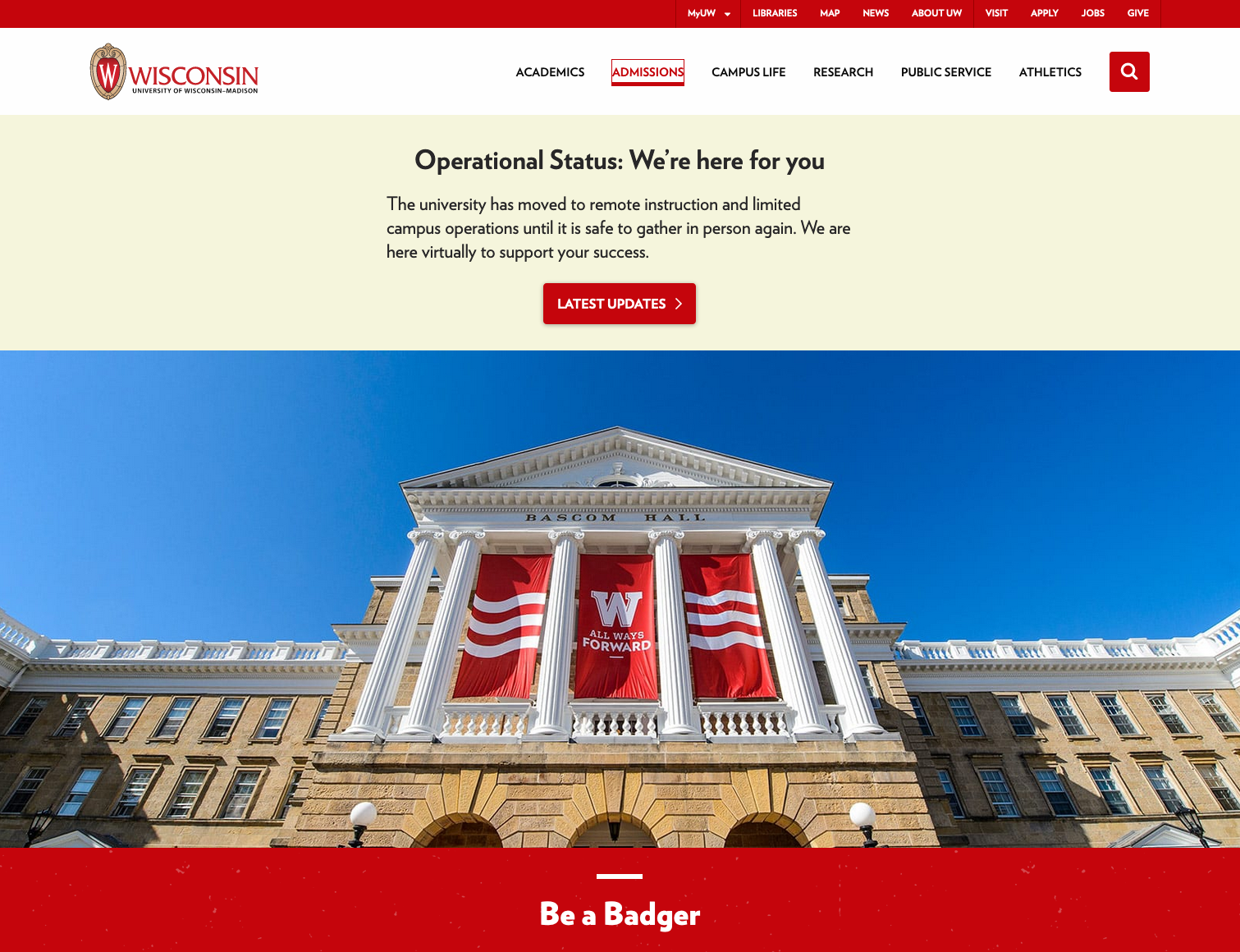
As it turns out, Kansas and Wisconsin are two very evenly matched schools. Both have flat menus (no submenus). Both provide a prominent underline that appears on focus so keyboard users can easily tell where they are. Both are wrapped in a <nav> element, and both have a meaningful aria-label (“Main Navigation” and “Main Menu” respectively). There’s really very little difference in the menus themselves, so this game goes into overtime and I have to look at other features of the website. As a loyal Jayhawk fan, I hate to do it, but Wisconsin wins because their home page features a static photo of a campus scene, whereas Kansas features a distracting video that cannot be paused by any obvious means.
Winner: Wisconsin
Iowa vs Kentucky
This is a game of contrasts. Iowa is another school with a flat menu, whereas Kentucky has a “mega menu”, which I define as any submenu that includes content and structure beyond a simple list of links. Mega menus are complex, and can present usability challenges for users with disabilities unless implemented especially well. A mega menu school beating a flat menu school is the equivalent of a 12-seed beating a 5-seed. The mega menu would really need to play a perfect game. Kentucky’s menu is actually pretty good. When a top-level menu item has focus, the submenu is triggered with Enter, then the submenu items can be accessed with the tab key or arrow keys. The element that triggers the submenu is a link, but it’s coded with role=”button” which is appropriate given its functionality (buttons trigger actions, links lead to other places). It also has aria-expanded and aria-haspopup. There are some problems with its implementation though. While Enter works to trigger the submenu, space does not, and one would expect space to work to activate a button. Also, when users arrow through the links in a submenu, the menu’s JavaScript keystroke handlers don’t trap the keystroke event, so it’s allowed to escape and perform its default browser function, which is to scroll the page. So users can arrow through items in the submenu but the menu won’t hold still. This flaw makes for a close battle, but Kentucky is otherwise executing their game plan well enough to triumph.
Winner: Kentucky
Gonzaga vs New Mexico State
Similar to the previous game, this is a battle of a mega menu (Gonzaga) vs a simple, flat menu (New Mexico State). Unlike Kentucky, Gonzaga’s execution is a bit off. As noted in the above stats, they’re one of only 5 schools to use role=”menubar”, which as noted above I’m not going to fault as long as it works. However, the top-level menu items that trigger submenus are links coded with role=”menu”, which is not quite right. These should have role=”menuitem” since they’re the items that comprise the top-level menu. They do have aria-haspopup=”true”, which is good. The ultimate question is: How well does this work for screen reader users? The answer: It’s hard to tell. Testing with a screen reader, the Gonzaga home page is that friend who you love dearly, but they just won’t stop talking. Somewhere on the page, well below the portion that’s visible without scrolling, there’s an auto-rotating carousel that’s wrapped in an ARIA live region (aria-live=”polite”). Hence, the constant chatter while I’m trying to navigate the menu. I can’t count the number of times I’ve heard this: “Even though we can’t see you in person right now, we want to be sure you know just how amazing the Gonzaga experience truly is.”
Winner: New Mexico State.
Indiana vs Arizona
Indiana is another school with a flat menu and a beautiful visible focus indicator (a deep Hoosier-red border around the focused element). They’re gonna be hard to beat. Enter the Arizona Wildcats, another red school. If we weren’t social distancing, the arena would surely be packed with red-clad fans for this classic matchup. Arizona has a simple dropdown menu that is very well executed. It has clear visible focus. Submenus are triggered with Enter, space, or down arrow. When a submenu is open, it can be navigated with tab or arrow keys, and closed with Escape. The top-level menu items are links with role=”button” and include aria-expanded and aria-haspopup attributes. The result is a menu that is easy for everyone to use. Bonus points for difficulty over Indiana’s relatively simple menu.
Winner: Arizona
Boston University vs Texas
Boston’s menu is not like any other in the sample. It’s a simple, flat menu with only three links (“Admissions”, “Academics”, and “Research”) but also includes a “Full Menu” button, which triggers a more extensive menu in a modal dialog. The “Full menu” button is well coded, with aria-expanded and aria-controls attributes, as is (for the most part) the modal dialog (e.g., role=”dialog”, aria-model=”true”). One flaw is that the dialog wrapper has aria-labelledby=”modal-full-title”, and there’s no element with that id. So it’s a dialog without a name.
Another interesting feature is the visible focus indicator inside the dialog: Focus is visibly indicated by indenting the item. That’s not super obvious, but arguably obvious enough, and if you tab quickly enough down a column of menu items you can create a cool snake-like effect. That serves no functional purpose, but it’s fun.
The modal also has a prominent Close button at the top left (the first item to receive focus when the dialog opens), or it can be closed with Escape. Beat that, Texas.
They can’t. It’s unfortunate the Longhorns end up on this line in the bracket. Their menu is actually quite good in many respects: Good keyboard support, ARIA markup in all the right places. They even support jumping to any menu item in an open submenu by typing the first letter of that menu item. That’s a feature that’s recommended in the W3C Menu or Menubar design pattern, but Texas is one of only two schools in the tournament to implement it (the other is North Carolina State). That said, the Texas menu has two major issues: First, the sole visible focus indicator is a subtle change of color (not accessible to sighted users who are unable to perceive the color difference). Second, there’s inconsistency within the menu: Some of the top-level menu items trigger submenus and others don’t, but they all look the same. There’s no visible indication that some of the menu items have submenus.
Winner: Boston
Hofstra vs Florida State
Hofstra made it this far in the tournament because they’re in an easy bracket. Their menu is coded with role=”menubar” (no harm, no foul). Unfortunately the implementation isn’t quite right. My experience testing with a screen reader was very sporadic. Sometimes Enter, Space, or down arrow triggers a submenu, but not always. Sometimes nothing happens, sometimes I follow the link to a new page when I just wanted to access the submenu. Also, pressing Escape closes the submenu but rather than return focus to the original menu item, focus always goes to the “MyHofstra” link.
Florida State’s menu is flat and simple, with excellent visible indication of focus. It’s apparent that their game plan is just to play it conservative and let their opponent self-destruct. And that’s exactly what happened in this matchup.
Winner: Florida State
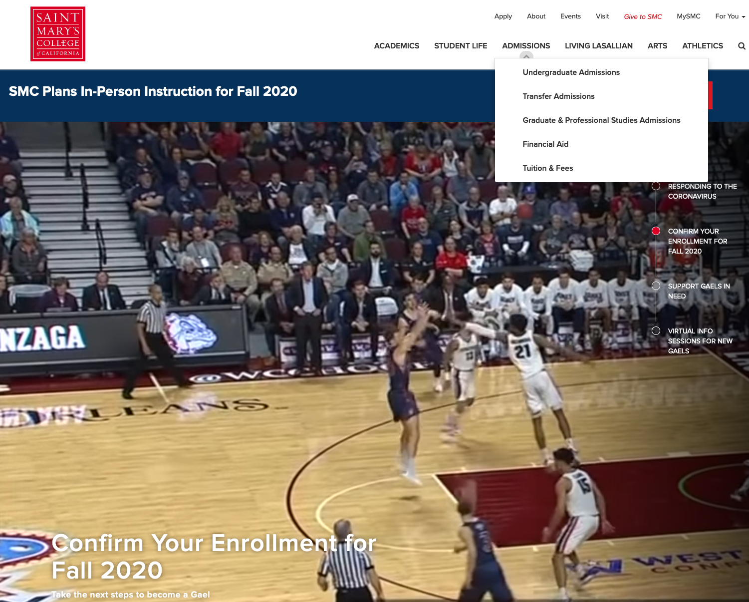
Saint Mary’s vs Ohio State
Saint Mary’s home page features a background video that includes footage of both the men’s and women’s Gaels basketball teams! (Theirs is the page that’s featured in the screen shot near the top of this article). I confess that I lingered longer on this page than on most of the others, and the basketball vibe may have biased my judgment.
Their menu is unique. Each list item contains both a link and a button. The link targets a new page (as links should), and the button opens the submenu (as buttons should). This link/button combo is necessary when you have a menu in which the top-level menu items are links to web pages but also are meant to trigger submenus. One element can’t serve two functions. Unfortunately few websites separate these functions into two elements – mouse users can hover to show the submenu or click to follow the link. Keyboard users can’t so easily do both. Saint Mary’s has not only provided both a link and a button, but they’ve done it in an interesting, creative way that (in my opinion) works. The button is hidden by default, but is visibly exposed when a user presses tab from any menu item.
The menu is not without its problems though. If you press space when the newly revealed button has focus, the submenu opens briefly then quickly closes (a bug). Pressing Enter instead works as expected, and all other keys (arrows, tab, Escape) work as expected. The menu also has ARIA markup in all the right places.
Ohio State, on the other hand, has a strange menu. Each menu item has two links, one for desktop and one for mobile, and only one of these is visible at a time. What’s interesting is that the mobile link has some accessible markup (aria-haspopup, aria-expanded) but the desktop link does not. On the desktop, it’s impossible to even trigger the submenus with keyboard (actually, not impossible – they can be triggered with the down arrow, but once open it’s impossible to navigate into them).
Winner: Saint Mary’s
Bradley vs Creighton
You couldn’t ask for two more evenly matched schools for our final matchup in The Sweet Sixteen. Both have flat menus, contained in <nav> elements (good) with no aria-label (not so good). The difference-maker is the visible focus indicator. Bradley flips the foreground and background so it’s super easy for keyboard users to see where they are, not to mention aesthetically pleasing. Creighton simply relies on the default focus indicator, which is a faint dotted line in Firefox and Microsoft browsers.
Winner: Bradley
Elite Eight
Wisconsin vs Kentucky
This battle pits Wisconsin’s simple flat menu against Kentucky’s high-octane mega menu. As described in Kentucky’s matchup in the previous round, Kentucky has done some work to make their mega menu accessible, but there are problems (no spacebar support, buggy support for arrow keys). Their mega menu was good enough to get them past one flat menu Big Ten team (Iowa), but not good enough to get them past a second – arguably superior – flat menu Big Ten Team. Wisconsin’s flat menu has a much better visible focus indicator than Iowa’s.
Winner: Wisconsin
New Mexico State vs Arizona
New Mexico State is another flat menu school with excellent visible indication of focus. Looking ahead, the potential matchup between the Aggies and the Wisconsin Badgers would be amazing! But if you’re thinking I have a bias towards flat menus, that’s not quite accurate. I have a bias against poorly implemented dynamic menus. Given the choice between a cheap car that’s 100% reliable and a high-end luxury car with lots of bells and whistles that’s always in the shop, I’ll take the reliable car. Arizona is that rare combination though of reliable and sophisticated. However, one peculiar quirk that I let slide in the previous round is that every link in the Arizona submenus has aria-expanded=”false”. This is expressed by JAWS as “Link Apply collapsed”, “Link Request Information collapsed”, etc. Why is every link collapsed? What does that even mean? That’s sure to be confusing for users. Arizona’s sophisticated menu needs to go back in the shop.
Winner: New Mexico State
Boston vs Florida State
Once again, we have another flat menu school (Florida State) with excellent visible indication of focus against a school (Boston) with a more sophisticated menu. Unlike Arizona though, Boston has pulled off their unique menu-in-a-modal dialog design with near perfection. The one flaw mentioned in the previous round is the missing label on the dialog, but in my opinion that doesn’t significantly impede the usability of the dialog for screen reader users. Since we need to hold schools to higher scrutiny in these higher rounds of the tournament, I do have some concerns about Boston’s color contrast. It’s a very dark site. The menu text is a thin font presented against a solid black background. The officials have to go to the monitor for this one. After several minutes examining the color choices while the color commentators speculate on why it’s taking so long, the officials finally emerge to announce the verdict: The color contrast is in fact quite good! According to the Color Contrast Checker from The Paciello Group, the contrast ratio is 14.22:1, which far exceeds what’s required by the W3C Web Content Accessibility Guidelines, even at Level AAA.
Winner: Boston
St. Mary’s vs Bradley
In this matchup, Bradley is the flat menu contender with excellent visible indication of focus, and St. Mary’s is the contender with the well-executed dropdown menu that features both a link and a (hidden) button for each top-level menu item. St. Mary’s is also the contender that includes basketball footage in the background on their home page, which again gives them a slight advantage. The problem: The spacebar bug. In basketball, it’s often said that no matter how good your team is, you can’t make it to the Final Four if you can’t hit free throws down the stretch. In web accessibility, you can’t make it to the Final Four if the spacebar triggers the submenu then immediately closes it.
Winner: Bradley
Final Four
The Final Four features three flat menu schools against one school with a unique menu in a modal dialog. At this point, all the menus are good. You don’t get to this level in the tournament unless that’s true. Wisconsin, New Mexico State, and Bradley have all made decisions to keep their sites simple. Boston too has a simple design overall, but they’ve opted to provide the full menu for users who want it, just one click away in a reasonably accessible modal dialog. From my perspective, at this point there are no clear winners. So I’m changing the rules a little, and running a WAVE analysis on each home page to determine the winner. Here are the results:
- Wisconsin has 0 errors. New Mexico State has 3 errors. Winner: Wisconsin.
- Boston has 4 errors. Bradley has 8 errors. Winner: Boston.
National Championship
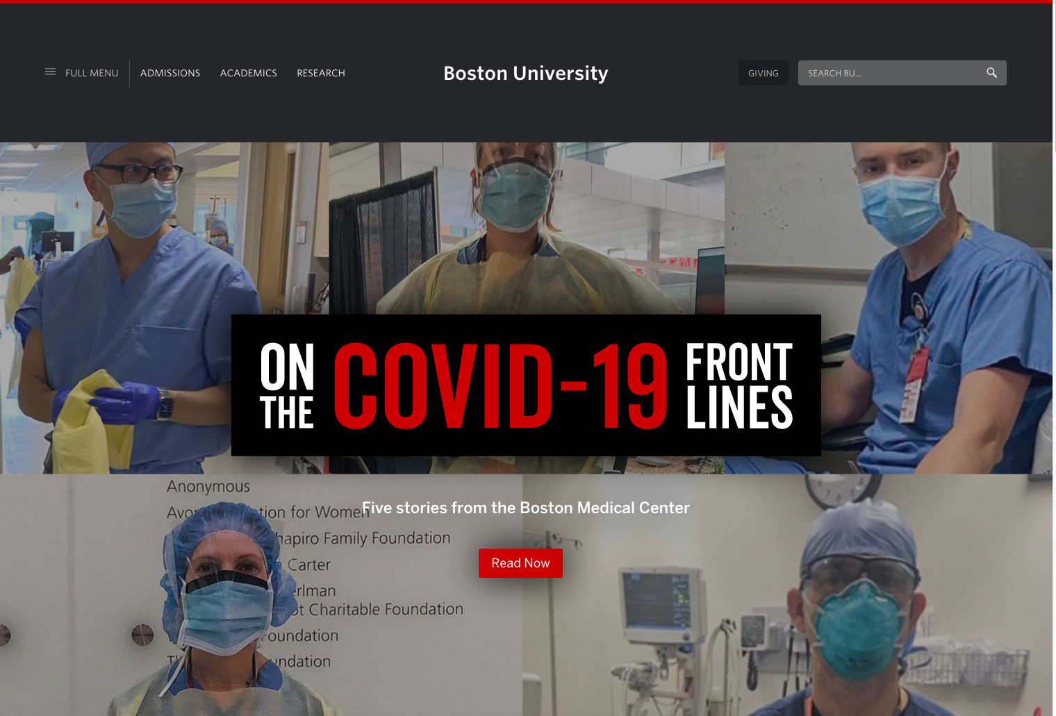
Boston University would definitely have been in the NCAA basketball tournament. They had already secured their spot by upsetting Colgate in the Patriot League championship tournament (one of the few conference tournaments to be played in full before society came to an abrupt halt in early March). According to Joe Lunardi, Boston University would have entered the tournament a 16-seed, and would have had to compete in a play-in game before getting in to the official Round of 64. If this were basketball, there’s virtually no possibility that Boston would win the tournament. But it’s not.
There is just one thing though. That modal dialog I’ve spoken so highly about? It has six headings, with a list of links beneath each. Each of those headings is an <h4>.
In HTML 1.1 (1993), Tim Berners Lee – the inventor of the Web – said this about headings:
The heading elements are

                <h1>, <H2>, <H3>, <h4>, <H5>, <H6>

   It is not normal practice to jump from one header to a header level
   more than one below, for example for follow an H1 with an H3.
   Although this is legal, it is discouraged, as it may prodcue
   strange results for example when generating other representations
   from the HTML.
(Note that “prodcue” is his spelling).
In a modal dialog, there should be an <h1> heading, something like “Boston University Menu”. This heading could also have id=”modal-full-title” which would solve the orphaned aria-labelledby problem. With the <h1> in place, each of the six subheadings should be tagged as <h2>. There’s no good reason they should be <h4>.
In contrast, the heading structure on the Wisconsin home page is quite good. There is a single <h1> (“University of Wisconsin-Madison”), several <h2> headings at appropriate places, and a few <h3> headings for deeper content. The University of Wisconsin home page, with its simple, yet elegant design, its good heading structure, and its super easy-to-use navigation menu, is the NCAA 2020 National Champion. Congratulations to the Badger Nation!