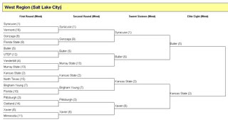
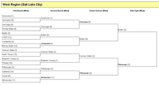
The NCAA Men’s Basketball tournament is now down to four teams that will compete in Indianapolis next weekend to determine the National Champion. Since 2006, I have
created an Accessible NCAA Tournament Bracket, and this year for the first time I hosted an accessible tournament pool that allowed screen reader users and non-mousers to fill out their own brackets, compare them with other participants’ brackets, and compete amongst each other for bragging rights.
I thought I’d take a moment to share how I’m approaching the challenge of making brackets accessible. Each year I try to improve upon this, so please feel free to share feedback and ideas for how this might be improved or approached differently.
The Bracket
To understand the bracket, you first must understand how the tournament is organized. After an initial play-in game for the 64th and final slot, the tournament features 64 teams, organized into four regions, who play four rounds of elimination games until four teams remain – The Final Four. Winners in the first round of the Final Four compete in the National Championship game, the winner of which is National Champion.
Unfortunately the structure of brackets is quite complex, and HTML is insufficient for capturing the multi-directional relationships between games. ARIA doesn’t help either, as there is no role=”bracket” or any other truly applicable role. Given these constraints, a key question I needed to answer was: How can I best organize the structure of the bracket using HTML markup?
To answer this, I decided to divide the bracket into four smaller brackets, one for each region (plus a fifth bracket for the Final Four). Smaller brackets are easier to manage, and are easier for users to navigate and understand.
To present the games in one region, I initially considered using a data table, and this approach may still have merit. However, the data table would be extremely complex, with each column from left to right containing table cells with colspan values double those of the previous column. I created a draft using this approach, and included all the necessary markup for making complex data tables accessible. Especially noteworthy, I used the headers attribute to reference the cells of all games that fed into the current game. This resulted in an excessively verbose table for screen reader users, but I think anything less would fail at conveying the relationships between games. Ultimately I decided that using a data table was not going to result in a very usable bracket for screen reader users, so I moved to Approach #2.
Approach #2 is the approach I ultimately used, and the one that I’m currently using today. The name and location of each region is a level 2 heading:
Within each region, the name of each round is a level 3 heading, and references the region by name so that screen reader users can easily be sure of their current context:
Beneath each level 3 heading, the games within that round and region are presented as an ordered list of games, with a brief description of the game for easy reference (e.g., "Sweet Sixteen Game 1"). Each item in the list of games contains a nested unordered list of two teams. Here’s what it looks like for the Sweet Sixteen games in the West Region:
<ol>
<li>Sweet Sixteen Game 1
<ul>
<li>Syracuse (1)</li>
<li>Butler (5)</li>
</ul>
</li>
<li>Sweet Sixteen Game 2
<ul>
<li>Kansas State (2)</li>
<li>Xavier (6)</li>
</ul>
</li>
</ol>
For games in which teams are not yet known (because the previous round games haven’t been played yet), the unordered list contains a reference to the parent or feeder game (e.g., "Winner, Syracuse vs. Butler" or (before those teams were known) "Winner, Sweet Sixteen Game 1".
Feedback I’ve received from screen reader users is overwhelmingly positive, and folks say they are easily able to explore the bracket backwards and forwards using their screen readers’ hot keys for navigating between and among the various HTML structural elements.
The next challenge then was making all this look like a bracket so sighted users could use it too.
The CSS
Stylizing the bracket was actually fairly straightforward:
- Within each region, each round (a div, containing the level 3 heading and the list of games) has width:20% and is floated left so that four rounds appear as adjacent columns of equal width.
- Each line on the bracket (a list item in an unordered list, nested within an ordered list of games) has either class=”top” or class=”bottom” depending on its position. Both have a 1 pixel solid bottom border, but only list items with class=”bottom” also have a similar border on the right side, thus creating the lines on the bracket.
- Since brackets are more spread out vertically in later rounds, the height of each list item with class=”bottom” is increased in later rounds by increasing the value of padding-top.
Hiding Text from Sighted Users
Descriptions of games, and placeholder content where teams are not known, is all important content that helps screen reader users to explore the bracket, even before any games have been played. For sighted users, all of this extra information is unnecessary. It’s communicated visually by the relationships between lines. Since the lines (borders) are important for sighted users, we can’t hide the list items that contain team names or other text, but we can wrap that text in a <span> with class=”hidden”. That way, we can hide the text without hiding its parent list item, which has the borders we want sighted users to see.
A common trick for hiding content from sighted users, while assuring that it’s still accessible to screen reader users, is to position the text off screen. However, in this case I simply masked the text against the color of the background, and set overflow:hidden and whitespace:nowrap to prevent long hidden descriptive text from messing up the visual spacing of the bracket.
Tournament Pool: Good Picks, Bad Picks
Setting up a form by which users can fill out a bracket before the tournament starts was straightforward enough. The form was simply a list of games, with radio buttons for selecting teams. Users submitted their picks for each round, and the predicted winners were used to populate the form labels for subsequent rounds.
Beyond this, one challenging feature was a set of links that users could select in order to display information about each team in a pop-up, so they could make informed decisions when making their predictions. This involved use of ARIA markup, and deserves an entire blog post of its own. Stay tuned for that.
Once a user has made their picks, they can choose to view a bracket that compares their picks with the teams that actually won. Visually, this is typically presented with the user’s picks on each line, and a line through each incorrect pick. That’s the approach I took too, as shown in the following screen shot of my own Western Regional bracket (Note how few of my picks are incorrect! Also note that I correctly picked Butler to win that region!)
In HTML, the line through text is attained with the <del> element, but most screen readers don’t announce this by default. So again we resorted to using hidden text, just for screen reader users. If users picked a team correctly, the team name is followed by the hidden text "Correct pick!" And if they picked incorrectly, their pick is shown (with a line through it), followed by the hidden text "Wrong pick! Butler should be on this bracket." (or whichever team happens to be the correct pick for that game).
Wanna Play?
Stay tuned to this blog for future tournament news. We’ll be playing again in March 2011, but prior to that there’s a very good possibility that I’ll be going international with an Accessible World Cup bracket. I’m also hoping at some point to package this as a toolkit so anyone can use it to create their own accessible tournament brackets. Another project I’ve done some preliminary work on is BracketML, a markup language designed to explicitly communicate the complex relationships between items in a bracket. Again, stay tuned…


3 replies on “Accessible March Madness”
cool idea keep up the good work
Surely DEL and not STRIKE, Terrill?
You got me there, Joe. Of course I meant DEL, since STRIKE is deprecated, although DEL unfortunately isn't announced by screen readers either.