This post comes live from the National Student Electronic Media Convention, the annual fall convention of College Broadcasters, Inc (CBI). It’s in Seattle this year, and I was invited to present on web/media accessibility along with folks from WKNC, North Carolina State University’s student-run radio station. This is a very cool coincidence, since my co-presenters weren’t even aware that I was once employed by NC State, and was a regular listener to WKNC in those days.
In fact, I’m a huge fan and supporter of college radio! Two of the six stations on my car radio dial are KEXP (UW) and KUGS (WWU), and before moving to Washington I was a regular listener of WKNC (as I mentioned) and before that, KJHK, “The Sound Alternative” in Lawrence, Kansas. Also, as an independent musician, the only radio stations that have ever given my music air time are college stations.
To prepare for my presentation, I thought I would do a quick informal assessment of the state of accessibility on college radio station websites. Hence, this blog post.
Top College Radio Stations
Wikipedia lists 460 stations in the United States, plus many others internationally, on its List of Campus Radio Stations page. That’s too many for my purposes. So I set out to narrow the scope of my review, focusing on the “Top” college radio stations.
Princeton Review publishes an annual Top 20 College Radio Stations, though their methodology is suspect as explained in this article by Jennifer Waits on Radio Survivor.
A Google search reveals at least a couple of other sources for college station rankings, both of which seem to be highly subjective, but both also seem to be carefully researched and their choices seem logical. They are: 10 of the Most Influential College Radio Stations in the US according to Angela Mastrogiacomo on Soundfly Flypaper (2018); and The 25 Best College Radio Stations according to Monarch on Pigeons & Planes (2013).
I compared all three of these sources, and found that only seven stations made two or more lists, and only two made all three (WERS of Emerson College and WICB of Ithaca College). I initially limited my review to these seven stations plus three of my own personal favorites in order to round up to an even ten. But after reviewing those ten, I was having such a good time exercising my passion for web accessibility while being exposed to great new music, I decided to review several more from the various Top Stations lists. Ultimately I stopped keeping track of my findings, and was just exploring, so this report is extremely unscientific.
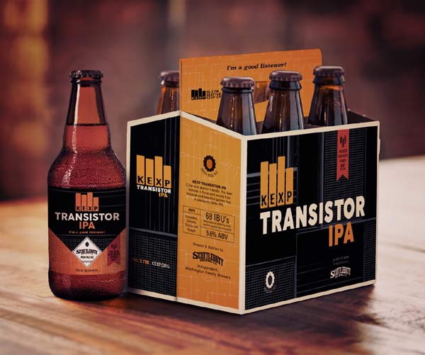
I was also enjoying some KEXP Transistor IPA while conducting the review, which might have impacted my fastidiousness.

What I measured
For a quick web accessibility review of so many sites, it’s tempting to whip out a web accessibility checker like the WAVE Web Accessibility Tool from WebAIM. This can be very helpful and informative, and I encourage anyone who’s reading this blog post to try it.
However, I like to get beyond what any automated checker can provide, and focus on functional accessibility. Why does one visit college radio station websites? What function are they hoping to perform? As a user and fan myself, I do so for three primary reasons:
- to listen to the live stream.
- to read the playlist and find out what I’m listening to.
- to donate (it’s true – I happily retired my most recent Chevy van to KEXP).
So, I focused primarily on those three functions, and asked two questions:
- How easily can I perform these functions without a mouse? (Some people are physically unable to use a mouse, and might be using the keyboard instead.)
- How easily can I perform these functions with a screen reader? (Screen readers are tools used for exploring and reading websites and software via synthesized speech or Braille, rather than eyesight.) For my tests, I used the free Windows screen reader NVDA in Firefox, occasionally testing in Chrome as well if I encountered anomolies.
Initially, before I started getting sloppy, I assigned stations one of the following scores:
- Excellent – Easy to find and easy to use with both keyboard and screen reader.
- Good – Easy to find and technically accessible, but with minor problems that make it not so easy to use.
- Meh – Technically accessible, but not easy to find nor easy to use
- Bad – Not accessible. Impossible to use unless you’re a mouser with eyesight
- N/A – Some stations’ websites don’t include all three of the features measured.
I judged a feature to be “Easy to find” if it’s marked by a nearby HTML heading (which makes it easy to find for all users, including screen reader users).
Since I love college radio, I was a pretty lenient reviewer, but nevertheless found that most sites were earning Bad or Meh scores on all three functions. Ultimately I stopped scoring, and focused instead on cataloging the most prominent problems that seem to recur across sites. My hope is simply to share my observations so folks can learn from them.
The Results
Live Streaming
Not all stations offer a live stream, but those that do tend to feature it prominently, with a large button near the top of the page, like this one:

Unfortunately, these buttons are often completely inaccessible. They aren’t focusable with the keyboard, so only mousers can access them. And they have no labels such as “Listen Live” or “Play Live Stream” which are necessary for screen reader users to identify them.
In a few instances, the buttons are accessible but the media player is not. I strongly encourage college radio station web developers to check out Able Player, the fully accessible (and free) media player that I developed and maintain, with help from the open source community.
Another problem with live streaming is autoplay. At least one of the sites I reviewed started live streaming automatically, and a couple of others started live streaming immediately after I selected the live stream option. The former is worse than the latter, but the latter is problematic too if the live stream option leads the user to a new page with a new user interface with which to get acquainted. Media should only play when users request it (e.g., by pressing the play button on a media player). Otherwise it’s shocking and embarrassing when the music starts playing unexpectedly and you’re in an environment where you’re supposed to be quiet and don’t have your earbuds in. It’s also a problem for screen reader users, as they can’t hear their screen reader over the music, which makes it impossible to find the pause button. The only solution is to close the site.
Playlists
The most important thing to know about playlists is that they are, in fact, lists. Therefore they should be coded as lists (using the <ul> or <ol> elements in HTML).
If there’s a lot of information about each song (e.g., time played, title, artist, album) then an HTML <table> element would be appropriate, with column headings identified using the <th> tag.
Many of the playlists I reviewed were comprised entirely of <div> elements, which have no inherent semantic structure. Therefore, it’s very difficult for screen reader users to make sense of what they’re reading.
Consider this example:
Holland, 1945 Neutral Milk Hotel In the Aeroplane Over the Sea What Light Wilco Bandslam The Hardest Button to Button The White Stripes Elephant Living in the Future Dawes Passwords Be Here Now Basement Beside Myself
See what I mean? Structure is critical for accessibility. Without it, screen reader users have an experience with playlists that’s similar to the above mess.
Also, some playlists include artwork for each track, coded with <img> elements. Informative images need alternate text (coded with the alt attribute). However, in this context, the artwork is just decorative and could be coded with alt=”” or role=”presentation”, both of which instruct screen readers to ignore the image. However, on at least one playlist every image had alt=”Generic placeholder image”, which gets really obnoxious for screen reader users after a while.
Donation Forms
There are three types of college station websites when it comes to accepting donations: Those that don’t, those that simply provide text with instructions for where to mail a check, and those that provide an online form.
Online forms can be tricky to make accessible. The most basic requirement is that the labels that accompany form fields (e.g., “First name”) must be coded with <label> elements. This ensures that screen reader users know what information is being asked of them in each field. It gets more complicated, but that’s a good place to start, and there are lots of resources online that explain forms accessibility in more detail.
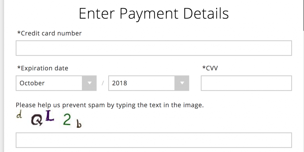
The form shown below was by far the best of all the sites I reviewed. It was easy to find, had good heading structure, and had properly coded labels on all the form fields. Absolutely anybody who wants to donate to this station can complete the form. Until, that is, they get to the very last field: A CAPTCHA!
The screen reader user who was about to donate her sizable fortune to her favorite college radio station is stopped in her tracks, unable to complete the donation. Sadly, her fortune will have to go elsewhere.
How do we fix all this?
Based on my first day of sessions here at the CBI convention, I’m getting the sense that many college radio station websites are created and maintained by students who aren’t expert coders. Many have inherited the site from prior students who are no longer around and who left insufficient documentation about the choices they had made. Content management systems such as WordPress seem to be common, with a wide variety of third party plugins and widgets used to generate content. All of this makes accessibility challenging.
My recommendations are:
- Take the #nomouse challenge! Try your website without a mouse (just use the keyboard). You should be able to access all links, menus, buttons, and controls with the tab key, plus other keys as they make sense (e.g., arrow keys, enter, space, escape). This is a very simple accessibility test. It won’t help you fix the problems, but it will help you get a sense of how significant they are. There’s more information at nomouse.org.
- Learn about web accessibility. One good starting point is the Developing Accessible Websites website we created at the University of Washington.
- Seek help at your institution. Most colleges and universities in the U.S. now have someone on staff whose role is to provide web accessibility support to their campus community. If you’re unable to find such a person by searching your institution’s website, try contacting the Disability Services office. They might serve in this role themselves, and if not, they can probably refer you to the appropriate person.
- Bribe me. Did I already say that I love college radio? I’m happy to help, so feel free to ask. If you want extensive help though, that might require some station swag and/or air time for something off my Everything and More album. If you’d like to explore the possibilities, feel free to Contact Me.

