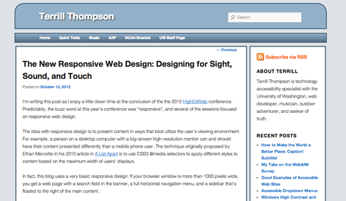
I’m writing this post as I enjoy a little down time at the conclusion of the the 2012 HighEdWeb conference. Predictably, the buzz word at this year’s conference was “responsive”, and several of the sessions focused on responsive web design.
The idea with responsive design is to present content in ways that best utilize the user’s viewing environment. For example, a person on a desktop computer with a big-screen high-resolution monitor can and should have their content presented differently than a mobile phone user. The technique originally proposed by Ethan Marcotte in his 2010 article in A List Apart is to use CSS3 @media selectors to apply different styles to content based on the maximum width of users’ displays.
Inspired by HighEdWeb, I decided to put some late night conference time into making this blog more responsive, and applied a few basic breakpoints at which the presentation changes. If your browser window is more than 1000 pixels wide, you get a web page with a search field in the banner, a full horizontal navigation menu, and a sidebar that’s floated to the right of the main content.
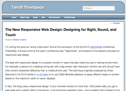
But if your viewing width drops below 1000 pixels, the content morphs into something slightly different. Most noticeably, the sidebar drops beneath the main content and the main content spans the full width of your display.
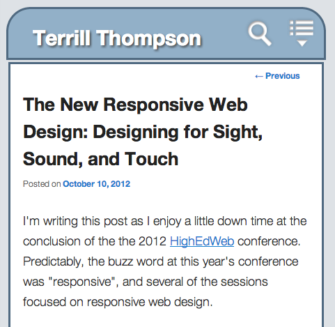
If your viewing width drops below 650 pixels, the search field and navigation menu no longer fit well in the available space, so they’re hidden by default and replaced with a pair of icons that can be used to toggle those features on and off as needed.
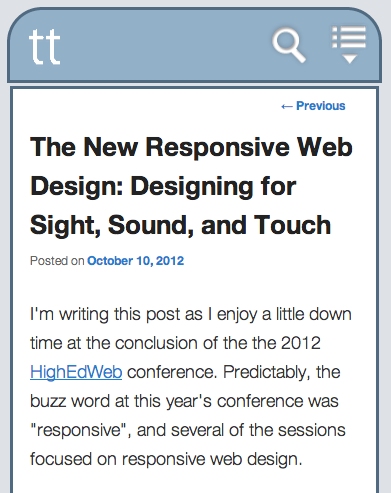
If your viewing width drops below 450 pixels, things get a little too crowded even for my name, so “Terrill Thompson” transforms into a small logo that just shows my initials “tt”. This same sort of responsive transformation happens on my music site.
I think the current interest in responsive web design is great for accessibility. It’s getting web designers and developers to appreciate the rich variety of devices that people use to access content. However, I also think we need to expand our responsiveness beyond the visual. Sure, your website looks great on devices of all shapes and sizes. But what does it sound like if a person’s using a screen reader? What does it feel like if someone is using a Braille device?
Testing with VoiceOver
According to WebAIM’s Screen Reader User Survey #4 Results, 71.8% of screen reader users use a screen reader on a mobile phone or mobile handheld device. Of these, 58.5% are using an Apple device with VoiceOver. Given these numbers, anyone designing responsive sites and testing their sites on an Apple iPhone, iPad, or iPod Touch should add one extra test: Test your site with VoiceOver! VoiceOver is the screen reader that’s built into iOS. It’s freely available to all of us who have iOS devices, so we should learn to use it and do so regularly. WebAIM’s article Using VoiceOver to Evaluate Web Accessibility includes a short section at the end on how to do this on iOS devices. It’s really quite easy – spend ten minutes memorizing the gestures, then practice those skills on a regular basis to review websites and mobile apps.
The main concern I had with my own design, and others like it, is that when the viewing width dips below 650 pixels, I start hiding content to save screen real estate, and replace that with buttons so users can toggle content on and off as needed. But if content is made visible by tapping a button, do screen reader users know what happened? Can they easily get to the newly visible content? Can they easily restore the content to its original hidden state?
To explore these questions and create a design that works well for VoiceOver users (as well as other screen reader users), I worked through a series of test pages. Here’s a summary of the features that were ultimately added or changed on my site theme as a result of these tests:
Accessibility of Search and Menu Buttons
These buttons aren’t technically buttons—they’re images. Clicking or tapping on either image triggers an event in JQuery that results in the search or menu feature being displayed. Images aren’t inherently interactive elements, so screen readers don’t provide any audible indication that clicking on these images will actually do anything.
To address this, I assigned an action-oriented alt attribute to each image (“Show search” and “Show menu”) as opposed to using something less action-oriented (“Search” and “Menu”), and added role=”button” to each image. Now VoiceOver announces these images as “Show search button” and “Show menu button”, which clearly communicates to the user the function of these images.
I also added code within JQuery that changes the value of these alt attributes from “Show” to “Hide” and back, depending on whether a corresponding feature is visible.
The next problem is that if a VoiceOver user taps on either of these images, there’s no audible indication that anything has happened. What should happen is the user’s focus should be taken to the newly visible element. So when they tap the Show search button, a search field appears and their focus is placed within that search field, ready to type. And when they tap the Show menu button, a menu should appear and their focus is placed on the first item in that menu.
Making this work with VoiceOver proved to be a difficult challenge. For the play-by-play of my frustrating late night troubleshooting efforts here at HighEdWeb, study the test pages. To summarize:
VoiceOver and Giving Focus to Newly Visible Content
I haven’t upgraded to iOS 6 yet (don’t want to give up my Google Maps). But in iOS5, VoiceOver is fussy, if not downright buggy, in its ability to handle content that is hidden first, then displayed on demand. After extensive testing, I think I now know that:
- If a single element is hidden with display:none, then changed dynamically to display:block, then that same element receives focus, VoiceOver is cool with this. No problem so far.
- If the element that’s hidden and shown contains other elements, and the element you want to receive focus is a child of that parent, VoiceOver does not support the change in focus. VoiceOver announces all the newly visible content if the user goes hunting for it, but it doesn’t go there automatically. The focus does in fact change for sighted users, but VoiceOver users are still back on the toggle button while the world goes on without them.
- In the case of the menu, this turned out to be a timing issue, which was addressed with the following JQuery code:
$('nav#menu').show(0,function() {
  window.setTimeout(function() {
    $('nav#menu ul li a:first').focus();
  },1000);
});
First, the menu is shown. I wait until that process is complete before trying to give focus to the first menu item. I would have thought that placing the .focus() method inside the callback function of .show() would have been enough to attain this. However, that didn’t work. So I added an additional timeout (1000 milliseconds = 1 second) before calling the .focus() method, which seems to reliably do the trick. Intervals less than 1 second were sometimes successful, but not often enough to be reliable.
- A timeout doesn’t work if the hidden and shown parent is a form, and the child you’re trying to give focus to is an input field. Read on for the solution that seems to work.
VoiceOver and Giving Focus to Newly Visible Form Fields
VoiceOver can only give focus to a newly visible form field if that form field is the field that was originally hidden. If its parent is newly visible, VoiceOver can’t give focus to the child. iOS gives focus to the child. It places the cursor in the newly visible form field (Search, in my case) and the on-screen keyboard pops up. VoiceOver does recognize the on-screen keyboard and announces whatever key happens to have focus, but never announces the search field itself. This is true regardless of how that field is labeled (I tried using a <label> element, title attribute, and aria-label attribute, all without success).
The solution I came up with, which seems to work:
- Hide the form but don’t hide it from VoiceOver. This would probably work if you positioned the form offscreen, but I used the clip method:
.hidden { position: absolute; clip: rect(1px 1px 1px 1px); /* IE6 and 7 */ clip: rect(1px, 1px, 1px, 1px); } - Having clipped the form, it’s now invisible to sighted users but VoiceOver still reads its contents. We don’t want that—The whole idea in adding the search toggle is to remove clutter until the user needs it. So, the next step is to hide any readable content that’s inside the clipped form with display:none. Now that content is invisible to everyone, including VoiceOver users.
- When a user taps the Show search icon, use JQuery to unclip the form, then set the search field to display:block and give it focus, like this:
$('#searchform').css('clip','auto').css('position','relative');
$('#searchfield').css('display','block').focus();
Since the newly visible field is the same one receiving focus, VoiceOver handles this just fine. It announces “Search, text field, is editing, Search”.
Summary
Just because a website looks good doesn’t mean it is responsive to the needs of all users. Check your website with VoiceOver. Despite the challenges described in the latter half of this blog, checking your site is easy! We should all do it regularly to get a better sense of where our interface falls short for people who are accessing it without sight.
Some solutions truly are easy, like using role=”button” to communicate the function of images, or to use action-oriented alt text like “Show search” or “Show menu”. We might never think to do such things until we’ve tried our sites with VoiceOver.
Other solutions are more challenging, but I think there will be fewer of those as VoiceOver improves (maybe the focus-on-children (FOC) bug is already fixed in iOS 6?) Meanwhile, if you have the skills to develop workarounds, these are problems worth struggling with, as they can have a huge impact on large numbers of users.
One Final Tip
I’ve known first-time VoiceOver testers to get frustrated with how difficult it is to turn VoiceOver off on their iPhone or iPad. Here’s a solution:
- Go to Settings
- Go to General
- Scroll down to Accessibility
- Scroll down to the very last option, “Triple-click Home”
- Select “Toggle VoiceOver” or “Ask”
Now you can turn VoiceOver on or off simply by tapping your home button three times.