Do you have control or influence over the design of one or more web pages? If so, then I encourage you to add this New Years resolution to your list: Underline your links!
Since the dawning of the Web, browsers have underlined links so users could distinguish link text from surrounding text. In fact, all major browsers still do this by default. Ever wonder why? Answer: Because it continues to be an effective way to communicate “this is a link”.
Unfortunately there’s been a growing trend over the last few years among web designers to remove underlines from links, relying on color alone to distinguish link text from surrounding text.
What’s wrong with using color as the sole means of identifying links?
First, it’s a violation of WCAG 2.0 at Level A:
1.4.1 Use of Color: Color is not used as the only visual means of conveying information, indicating an action, prompting a response, or distinguishing a visual element. (Level A)
Second, it forces your users to play “Spot the Link”, which can be a difficult or impossible game to win, depending on your users’ visual acuity, whether they have color blindness, and current lighting conditions.
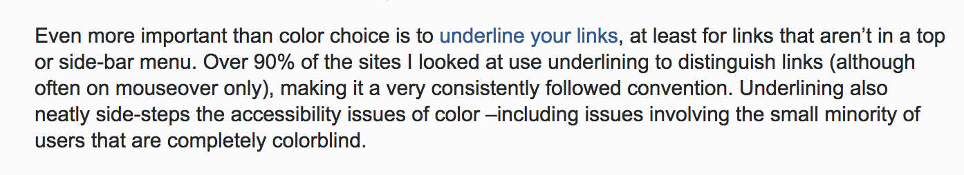
Worse yet, the trend among designers seems to be toward using very subtle color differences. The following example shows a reply to a question on UX Stack Exchange. A user had asked the question “Should hyperlinks be blue?”, and the leading response includes the following plea: “Even more important than color choice is to underline your links, at least for links that aren’t in a top or side-bar menu.” Ironically, the phrase “underline your links” is itself a link with no underline. The link text is dark blue, which for my eyes is very difficult to distinguish from surrounding text unless I hold my computer at just the right angle.
Fortunately, Stack Overflow (the company behind the Stack Exchange Network) is aware of and working on their accessibility. Look forward to some positive changes on their sites in 2018!
The solution
In CSS, do this:
a {
  text-decoration: underline;
}
Don’t do this:
a {
  text-decoration: none;
}
It’s ok to not underline links if it’s obvious they’re links based on the context. For example, there’s no need to underline all the links in a navigation menu, plus doing so would likely have a negative effect on the menu’s readability.
For most websites, you can probably restrict underlines to just those links that appear within paragraphs, or perhaps more broadly, within the main content. The following CSS would exclude underlines from links by default, but would add back the underlines for all links that occur within the main content (assuming the main content is marked up with an HTML5 <main> element):
a {
  text-decoration: none;
}
main a {
  text-decoration: underline;
}
The Good News: Underlines are cool again!
I’m already seeing signs that the trend I mentioned earlier (toward no underlines) is reversing (toward totally awesome underlines!) At least a couple of sites that I visit regularly have solid, easy-to-see underlines beneath their link text, which keeps me (and probably thousands of users like me) coming back as repeat visitors. Neither of these sites uses the CSS text-decoration property, but they instead are using alternative, more creative techniques that perhaps give them a bit more flexibility and work better with their designs.
WIRED Magazine
WIRED is using the CSS border-bottom property to add a solid blue border beneath link text. It’s thick and easy to see, as if they actually intend for people to notice and click on the links. This sample CSS code is simplified to illustrate their approach:
a {
  text-decoration: none;
  border-bottom: 3px solid #b4e7f8;
}
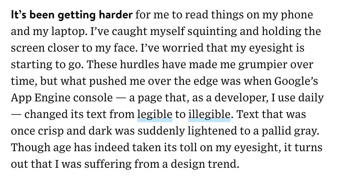
Here’s a screen shot from the WIRED article How the Web Became Unreadable, by Kevin Marks (a good, on-topic read):
Outside Magazine
Outside Online is using the CSS box-shadow property to add a solid yellow line beneath link text. This has a less dramatic effect than the one used by WIRED, but in my opinion it works really well with their site. The color matches their logo, plus it looks like someone underlined the links with a yellow highlighter (low tech is cool for outdoorsy types). Again, this CSS code is simplified:
a {
  text-decoration: none;
  box-shadow: inset 0 -3px 0 -1px #ffd204;
}
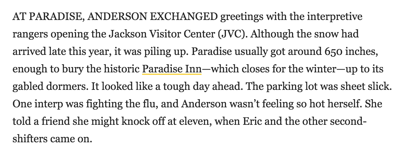
Here’s a screen shot from one of my all-time favorite Outside articles, The Devil on Paradise Road (off-topic, but still a great read):
In both of these examples, the effect is both functional and visually appealing. We can see the links! And it fits well within the site’s color scheme and overall design.
Got more cool examples?
Share them in the Comments. I’ll gladly promote any website that includes prominent underlines on link text.
6 replies on “New Years Resolution: Underline Your Links!”
Great post Terry! Related: Would be wonderful to have better browser support for text-decoration-skip-ink CSS property. This would help address concerns of readability of underlined text, especially for people with dyslexia. https://medium.com/@iamhiwelo/improving-text-readability-for-dyslexic-users-with-skip-ink-underlines-bf52a2f3426b
Overall, I’m also part of the “Pretty please underline links somehow” crew but I find both your examples (Wired and Outside) quite unfit for exemplarity as they both use lines with a very low contrast ratio against the grey background. I very much doubt that anyone with certain types of colour-blindness (e.g. protanopia or deuteranopia) or visual impairment will see that thin yellow line. 🙁
Very much looking forward the all-round browser implementation of the text-decoration-skip-ink CSS property.
[…] Regardless of the technique you use, perhaps follow Terrill Thompson’s lead in his post New Years Resolution: Underline Your Links! […]
[…] New Years Resolution: Underline Your Links! by @TerrillThompson […]
Craig Mod’s ‘On Margins’ podcast caught my eye recently, as he is using the “text-decoration: underline” and “text-decoration-color” properties on his links: https://craigmod.com/onmargins/
The fallback, of course is a standard underlined dark blue link. I’ve seen several designers, including Ethan Marcotte, begin to implement the text-decoration-skip-ink property on their personal sites recently: https://ethanmarcotte.com/
I found another good example: Newsweek is underlining their links with a 1px solid red border-bottom. For example, see today’s article Facebook is Officially for Old People.