In 2012, I resolve to think more broadly about who visits my websites. One group of users that often gets slighted, even by designers who are otherwise accessibility-conscious, is individuals who have difficulty perceiving or processing dark text on a light background. All major desktop operating systems, and some mobile operating systems, include optional high contrast color schemes that invert colors or remove color altogether. These color schemes apply across all applications on the device, including web browsers.
One would think this wouldn’t present any major problems for web designers. If a web page is created with good contrast between foreground and background, there will still be good contrast when colors are reversed.
The problem, however, is background images. When users enable high contrast mode in Windows, CSS background images are no longer displayed. This isn’t a problem in Mac OS X, but as far as I know this has always been an issue in Windows. It certainly is true in Windows 7 and Vista. The implications for designers?
Don’t use CSS background images to deliver content.
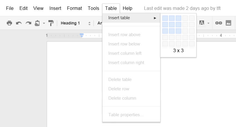
The following example is a screen shot of Google Docs with regular contrast:
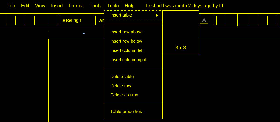
And here’s a screen shot of Google Docs in Windows high contrast mode:
The Google toolbar buttons are all <div> elements with content delivered using CSS background images. Therefore Windows high contrast users get no content. If they’re using a mouse they can hover over buttons to see tooltips, but that requires a lot of hunting, which seriously impedes usability.
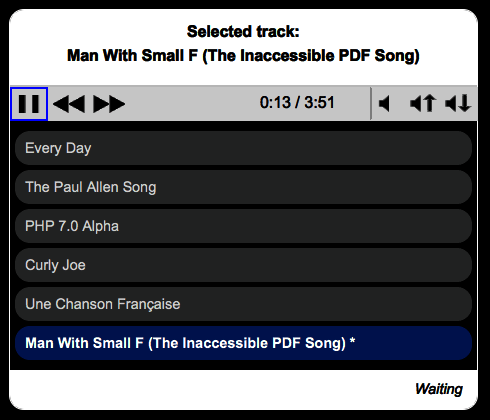
I confess that early versions of my very own Accessible Audio Player (AAP) were also guilty of this problem. I used <input type=”button”> for each button on the control bar (play, pause, etc.), and used CSS background images to add standard icons to these buttons . This is what it looked like for most users:
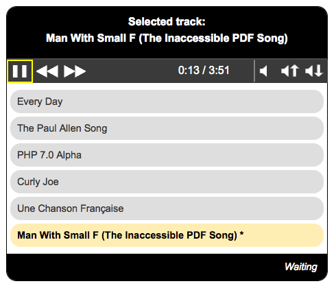
But this is what it looked like in Windows high contrast mode:
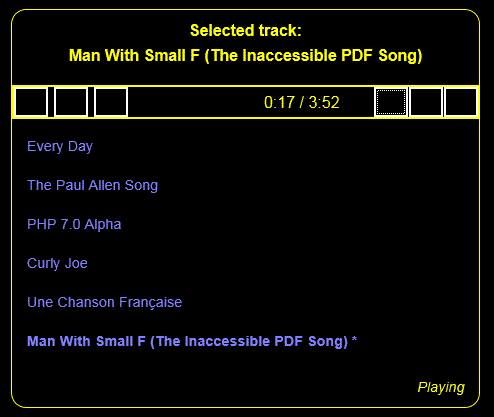
My Buttons Test Page demonstrates various methods for creating buttons, and itemizes some of the merits and problems of each. Ultimately I corrected AAP by replacing <input type=”button”> with <input type=”image”>, like so:
Screen readers still announce this as a button, and announce the alt text. And it’s now accessible to sighted users in Windows high contrast mode:
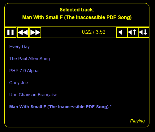
Notice that the buttons are now visible, but Windows doesn’t invert the colors of images. Given this, it’s especially critical for images to have good contrast if they’re used to communicate content. Also, if you’re like me you might be thinking “Purple on black? Is that accessible?” You might even go a step further and check that questionable text with a contrast checker such as Contrast Analyser. In doing so you might find that this text is borderline according to WCAG 2.0 success criteria for contrast. However, this is the default color for link text within three of the four Windows high contrast color themes. As designers there’s nothing we can do using CSS to change how these links appear. Just be sure they have ample contrast for users who aren’t using high contrast mode, and assume that Microsoft’s themes are supported by research with substantial user input (which I believe they are).
For the curious, here’s how it looks in Mac OS X black-on-white mode:
