Last week Steven Faulkner blogged about real world ARIA landmark use. He analyzed the HTML home pages of the top 10,000 websites, looking for ARIA landmark roles. Among his findings, he discovered that 130 of these pages are using role=”main”.
I’m often asked for good real-world examples of accessible websites, and this seemed like a perfect starting point for identifying some promising practices. So I spent a couple of hours over the last few days opening up each of those 130 pages and giving them my 10-second web accessibility assessment, which goes something like this:
- Use the Outline button on the WAVE toolbar to see if the web page has a halfway decent, logical heading structure. I was pleased to see that each of the 130 sites used HTML headings, but several sites had heading creep. Screen reader users benefit tremendously from good heading structure, but if a web page has too many headings, this offsets the benefits, and some of these sites have several dozen headings. If everything is a heading, nothing is a heading.
- Again using the WAVE toolbar, check for Errors, Features, and Alerts. If there are many errors, I assume this page will not serve as a good example, and stop checking. If there are only a few errors (e.g., fewer than five) I’ll check those errors and might be forgiving if they’re relatively minor and are offset by good accessibility in other areas.
- Try tabbing through the page. If there’s no visible indication of focus and it’s impossible to tell where I am on the page, this page will not serve as a good example.
- If the page includes video content, try playing a video to see if it’s captioned. If it isn’t, this page will not serve as a good example.
If a page passes the above tests, it’s worth a closer look.
It’s great that at least 130 of the top pages are using ARIA landmark roles. However, of all these pages, only eleven passed my 10-second accessibility assessment, and of those only seven survived the cut to be featured in this blog post. With that, here are seven pretty good examples of accessible websites…
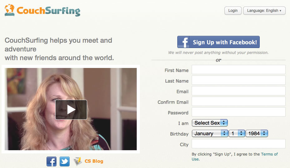
CouchSurfing.org
I didn’t create an account to explore this site beyond the home page, but I like what I see on the home page. There are a few areas where the page could be improved, but here are the features I’m impressed with:
- Excellent heading structure
- Clean, simple interface
- Video on the home page is captioned/subtitled in 14 languages..
- Labels on most form fields. The lone exception is birthdate, which is divided into three fields, only the first of which has a label. I consider this a minor problem, since the birth day and birth year fields are select boxes with pre-defined options, so screen reader users aren’t likely to have difficulty understanding this series of fields.
- A language picker at the top of the page. When users select a new language, the page is reloaded with all text translated. The lang attribute on the <html> element also changes to reflect the new language, so screen readers will pronounce the text correctly. This is a very cool feature, and makes the site accessible to millions of people who would otherwise be excluded due to language. However, it’s a little buggy. Selecting some of the languages (e.g., ” Slovenčina”) does not result in translated text on the home page, but does result in a changed lang attribute, so screen readers that support the selected language will pronounce the English text using the new language’s speech engine, which is not likely to be intelligible.
U.S. Government Sites
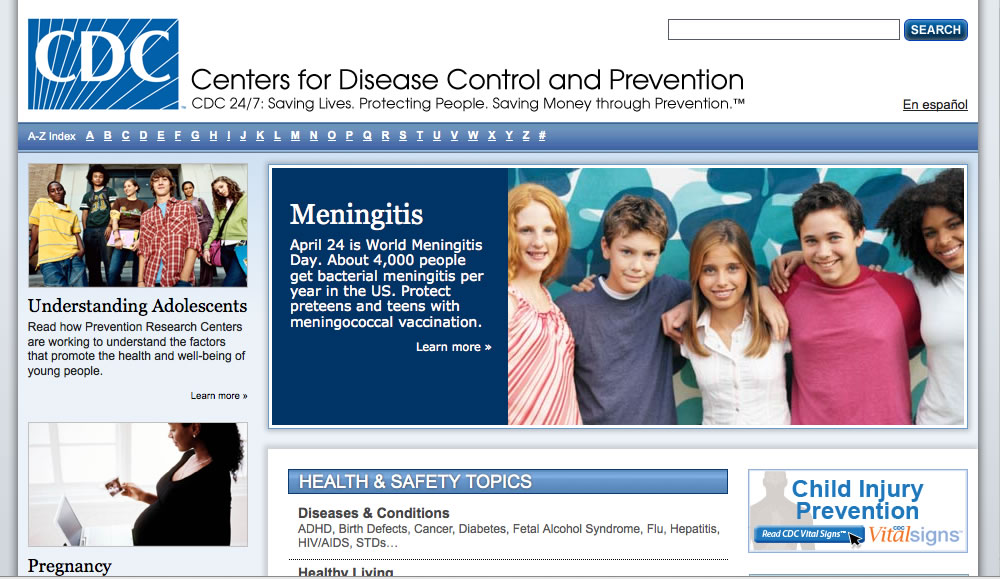
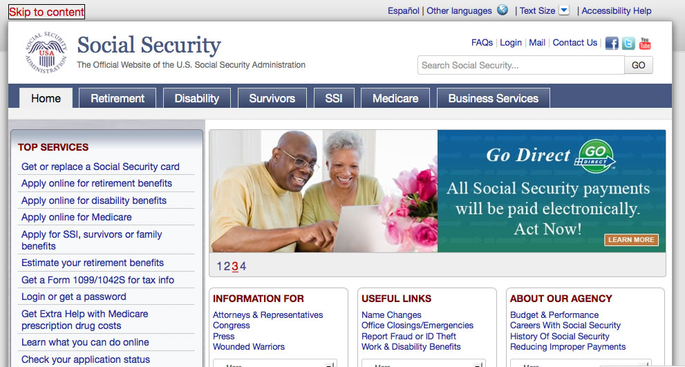
It’s not surprising to see U.S. government sites on this list, since they’re required to be accessible via Section 508 of the Rehabilitation Act. The best of the U.S. government sites in the sample are the Center for Disease Control and Social Security Administration sites.
The accessibility of these sites is very similar. Both sites include:
- A full set of ARIA landmark roles, including (in various places) banner, main, navigation, search, complementary, and contentinfo.
- Good heading structure. On each site, the home page skips H2, but it’s used on other pages in the site and it’s arguably more important to preserve consistency throughout the site than to sacrifice that consistency in order to have a perfect logical heading structure on any one page.
- Both sites include hidden same-page links at the top of the page for skipping to particular content. The CDC site includes five of these links, roughly corresponding with each of the landmark regions. These links become visible when keyboard users tab into the page. These links may ultimately be unnecessary if browsers support navigation by headings or landmarks. Screen readers already provide this support, but until browsers do so natively, non-mousers with eyesight can benefit from skip links like the ones on these government sites.
Both sites support multiple languages (English and Spanish), and both include lang=”es” on the <html> element of the Spanish pages. However, on the CDC site, in addition to lang=”es” the <html> element has xml:lang=”en”. This potentially sends mixed messages to screen readers (is this web page in Spanish or English?) JAWS 13 seems to honor lang rather than xml:lang but I don’t know about other screen readers.
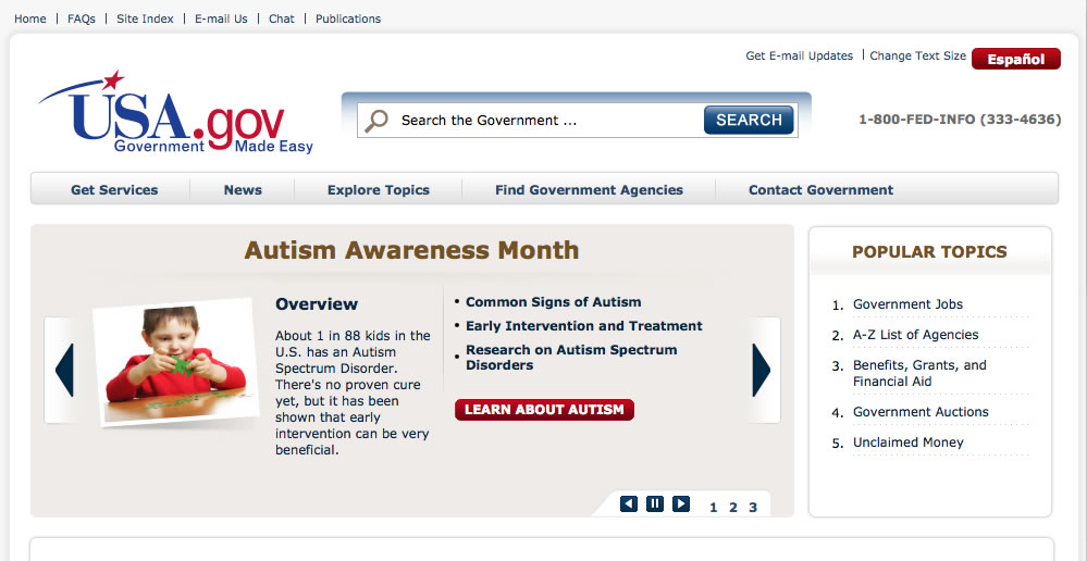
USA.gov
This site, the U.S. Government’s official web portal, deserves its own entry for its effort in creating an accessible slideshow. Many of the sites in the sample had slideshow widgets, but this is one has some accessibility characteristics that most others don’t have:
- It is fully controllable by keyboard. Users can tab into it, visibly see which control has focus, and execute that control by pressing enter.
- The slideshow auto-advances, which can be distracting for some users, but there’s a pause button so users can prevent the slides from advancing, and other buttons so users can control the slides manually.
- The slides are hidden with display:none and made visible with display:block, and each is marked up with aria-live=”polite” so when it becomes visible, screen readers will read the new slide only when it’s convenient for the user (i.e., they won’t interrupt if users are actively reading something else).
Coincidentally, the day I evaluated this site they were promoting Autism Awareness Month. That’s cool, and I confess it may have biased my assessment, although I really do think USA.gov has done a great job with their accessibility.
Canada.ca
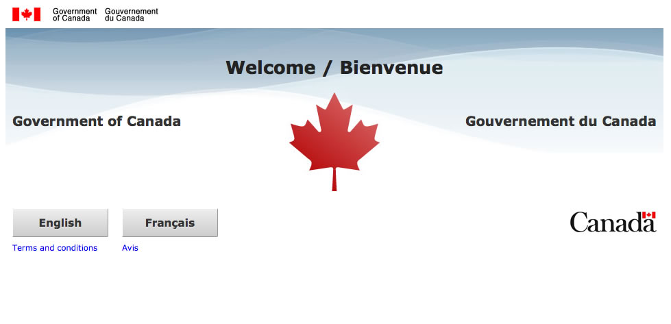
Not to be outdone by their Southern neighbors, the Canadian government site is highly accessible. The home page is a simple page, beautiful in its perfect symmetry between English and French. The default language as specified on the <html> element is English (lang=”en”, hey they had to pick one) but all French content is marked up with lang=”fr”. It’s actually quite pleasing, and very Canadian, to listen to this page with JAWS as it alternates between the two languages.
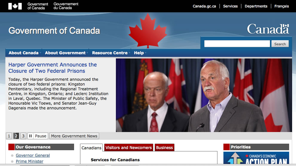
Once a user selects their preferred language, the content inside the site features several exemplary features:
- Extensive use of ARIA, not just for landmarks but for communicating roles and properties of other content as well. This is particularly important for making dynamic content accessible to screen reader users.
- A slideshow that has comparable accessibility to that on the USA.gov site.
- A keyboard-accessible dropdown menu that can be navigated not just with the tab key, but with a full keyboard model including tab, arrow keys, and escape. For more information about why this a good thing, see my recent blog post on Accessible Dropdown Menus.
Service-Public.fr
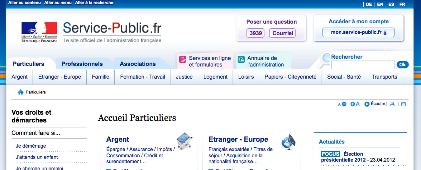
Not to be outdone by either the USA or Canada, the French government site has perfect heading structure, a full set of "Aller au" ("Skip to") links, and a 100% pass rate using the WAVE accessibility checker, which means (among other things) all images have alternate text and all form fields have labels.
Another feature that I like on this site is the Écouter
button:
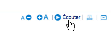
If the user selects this button, the page is read aloud while text is highlighted. This is powered by ReadSpeaker, which I think is a really cool product. It provides improved accessibility to a vast audience of people who might not otherwise have their own assistive technology, such as people who are not native to the language of the page, or people with dyslexia or other reading challenges.
Mozilla.jp
Mozilla Japan is the only Mozilla site to appear in the sample, but I could easily feature almost any Mozilla site in this review. The Firefox page in English has similar characteristics:
- A clean, simple interface
- Good heading structure
- A keyboard-accessible dropdown menu that includes support for arrow keys in addition to tab.
My only beef with the Mozilla site is that wherever video is shown (e.g., Firefox Flix) they provide subtitles in non-English languages, but don’t provide English captions. So Mozilla’s videos are accessible to people who read Ligure and Shquip, but not to Deaf or Hard of Hearing folks who need English captions.
Where are all the university sites?
Since I work in higher education, I was excited to see four university sites
within the 130-site sample. These sites (Penn, Harvard, USC, and NCSU) all have reasonably accessible sites, but each had problems that regretfully kept them off my final list.
Penn in particular nearly made the cut because I really like their keyboard accessibility. It amazes me how few sites provide visible indication of keyboard focus, when it’s incredibly simple to achieve (just add a style for a:focus in your style sheet). Penn did this, and consequently it’s very easy for sighted keyboard users to keep track of their position as they tab through the page. They also included a keyboard-accessible dropdown menu. However, there are some dynamic features on the Penn home page that really need ARIA markup for full accessibility. They also have a few contrast problems, most notably their slideshow navigation, which is red-on-red:

Other Good Examples?
These examples may or may not be the most accessible websites on the planet, but I think they’re very good. Since the first criterion for inclusion on this page is use of ARIA role=”main”, there are certainly plenty of other accessible sites that have not yet added this feature, as well as other accessible sites that aren’t among the top 10,000.
If you know of other sites that you feel are outstanding examples of accessibility, please share those in the Comments. I’m particularly interested in sites that have made challenging content accessible, e.g., using ARIA.

13 replies on “Good Examples of Accessible Web Sites”
I’d say Yahoo Mail and Easy Chirp are good examples, and your website of course 🙂
The online text to speech solution used for service-public.fr is ReadSpeaker® Enterprise™ [http://www.readspeaker.com].
Thanks terrill for the focus,
b from service-public.fr
Thanks for giving a shout out to the ReadSpeaker service. There are a several US websites that use the service. If anyone wants more information please have them contact me.
Hi,
more than the list of websites, I appreciate the 10-second method you describe. I think it’s worth explaining to developers and site owners that there are indeed some simple tricks to quickly assess a web page without having a deep understanding of the WCAG. Personally, I like removing all the CSS styles (with the Web Developer Toolbar in Firefox, shortcut is Shift+Ctrl+S). If the page is still pretty readable, with no clumsy technical code; if it shows a neat heading structure; if lists appear well structured and appropriately used; if all text, is in black (except links), left-aligned, and with its default font and size; then it’s been probably properly coded, HTML-wise.
Another simple action is to spot text that serves as labels for form fields. If clicking on them gives focus to the appropriate field, then it’s properly coded.
Regarding examples of accessible websites, I would suggest the Accessiweb gallery: http://www.accessiweb.org/index.php/galerie.html. Accessiweb is a reference list 100% based on WCAG2, and they deliver quality marks (the “Accessiweb label”) upon website owners solicitation. The website undergoes a thorough manual review (on a carefully defined 10-page sample, more or less), and it gets the label only if it’s flawless on every page. The level is reflective of the number of defects found and not corrected. Bronze is exactly equivalent to level A, Silver to AA, and Gold to AAA. So getting a Silver label means all A and AA tests were passed on all of the sample. Bronze, two stars: All A tests were passed, plus 50 to 75% AA tests. And so on.
I think it’s a pretty good sample of doubtlessly accessible websites. Of course they have put a special effort in getting this label, but somehow it shows that it’s possible. I also like the fact that they are pretty diverse in their purposes and target audiences, and are not visually different than the usual production. Which confirms our claims that accessible does not mean boring or not visually appealing – at least, if it’s the case, then blame the designer, not accessibility!
@Oliver, thanks for the additional tip for checking websites, and for the Accessiweb Gallery. I wasn’t aware of that site – looks like an excellent source for finding more good examples.
In your survey, any sites using ARIA landmarks that were NOT HTML 5? My understanding is that even though validators will fail an XHTML site that uses landmarks, they are still a valuable addition.
@Rick, I didn’t specifically look at doctype, but Steve Faulkner did in his original article (see the link at the top of this post). He found that 101 of the 130 pages containing role=”main” (78%) used the HTML5 doctype, which of course leaves 22% that didn’t. I do recommend using ARIA even if using an earlier doctype. Validation is important, but if validation and accessibility conflict, I think most would agree accessibility should trump validation. Assistive technologies that support ARIA landmarks do so regardless of doctype, and otherwise the presence of these role attributes has no ill effects in any user agent.
As a user who, while I can use a mouse, also likes to use the keyboard, I have found your articles very interesting. I have been trying to update the design of my site http://www.jamesrmeyer.com to include accessibility as much as possible, without compromising usability for the majority of users. I would appreciate some feedback on the site design.
Hi James, I don’t have time to do a comprehensive review of your site, but at a glance, looks great! Excellent heading structure, ARIA landmarks, accessible dropdown menus thanks to UDM4, and a nice comfortable, easy-to-read look and feel. Your content looks interesting too – I’ll have to check it out sometime when I have more time.
Thanks, Terrill
By the way, I had been using UDM menus, but stopped using them as they seemed to make loading very slow when I included Disqus comments. Besides, I was able to implement a nicer appearance in the latest browsers by adapting the ideas from your review of dropdown menus.
[…] List of accessible sites compiled by Terrill Thompson – with explanations! […]
FYI – JAWS, the most widely-used screen reader (as well as a few browser plugins) require you to use an anchor tag as the target of a “Skip to” link in order for the screen reader to actually go there – your page’s skip to content link uses a div (#content). Thank you for a great article and keep up the good work!
Hi Ashley, Thanks for the feedback. However, I respectfully disagree about JAWS. There was a time many years and versions ago when screen readers didn’t support id attributes as targets, but that’s no longer true. I just tested my site with JAWS 14 in both IE9 and Firefox 17. In both browsers JAWS identifies the link as “Same page link Skip to main content”, then if I click on that link using the left mouse button I jump directly to the “main region”, and a couple of down arrows later I’m on the main heading. I actually wrote an earlier blog post about this very topic.