Given the death of Google Reader in July and the eminent death of iGoogle in November, I’ve been shopping for alternatives. I need a single service that will serve as my dashboard and web portal, providing me with news updates, RSS feeds, and convenient access to bookmarked websites all from a single location. It needs to be cloud-based, browser-agnositc, free, and ad-free.
I’ve been combing over online reviews and soliciting input from trusted friends and colleagues for months, and a few weeks ago I finally narrowed my focus to two services, NetVibes and Protopage. Since then I’ve been using both together in separate tabs in various browsers. And finally, I’ve made my decision.
Here are my impressions based on the features that matter most to me.
Customizable views
The default interface for both services is a dashboard where feeds, widgets or apps are presented in blocks that can be placed pretty much wherever you like. Both services provide extensive customization options including color schemes and backgrounds. Both include support for tabs, and each tab can be customized individually, including the number and width of columns per tab.
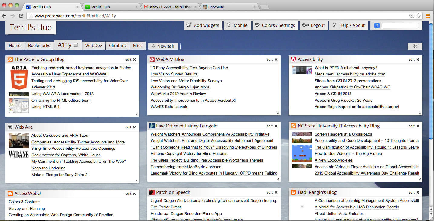
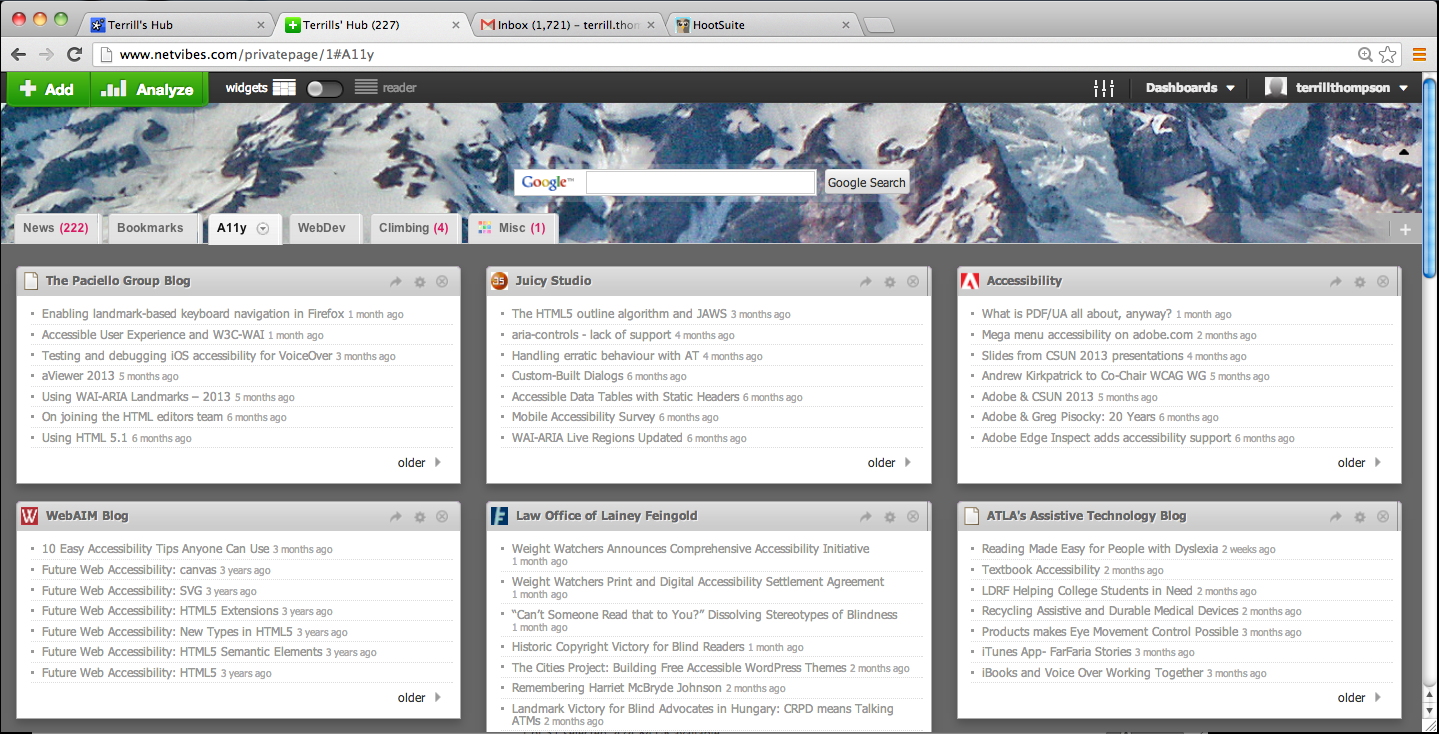
Protopage is better at drag and drop. In NetVibes I found that when I tried to drag a widget into a new column or tab I would often miss and have to try again. Protopage also supports dragging and resizing widgets—NetVibes does not. You can drag widgets so they span multiple columns, and can even drag a widget to a custom height. This was especially helpful for me, trying to find a home for PHD Comics.
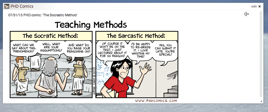
NetVibes isn’t at all flexible in this regard, and I was never able to get PHD Comics to display a full comic strip. The best I can hope for in NetVibes is a standard and boring RSS feed which I can click to open the comic on its website.
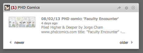
+1 to Protopage for making it possible (and easy) to have PHD Comics readable on my dashboard. This makes me a happy person.
Libraries of Widgets
Protopage provides plenty of preloaded feeds, including news feeds in dozens of categories. They also provide widgets such as bookmarks, sticky notes, to-do lists, Google calendar, weather, stock prices, and many more. Many widgets though only include one choice. For example, if you chose to add a weather widget, the only option is the AccuWeather widget. You can of course add RSS feeds from any other provider, but Protopage doesn’t do the legwork for you—you have to find the RSS URL and setup the widget yourself. This limited selection is a common complaint about Protopage among users who place a high value on choice.
In contrast, NetVibes has literally zillions of “apps” that can be added to your dashboard, and a search feature for finding apps that meet your needs. If I search for “weather”, I get 224 apps whose descriptions include “weather” but often these are only peripherally related to the search term. Most of these are broken, stupid, or both. There seems to be no screening of apps that are added to the library, and many appear to be first-time app developers just mucking around. You can sort by “Relevant first”, “Recently added first”, “Recently popular first”, or “All time popular first”, but even with all these sort options I found it very difficult to sift through all the junk in order to find quality apps.
+1 to Protopage since they’ve already done the sifting. Others may disagree, but I feel that too much choice can be a bad thing.
Keeping Up with Items Read or Unread
Each time you read an article in Protopage, it marks it as read by striking it out. Unfortunately it does so with CSS (text-decoration: line-through) rather than semantic HTML (e.g., the <del> element), so it isn’t really read – it just looks read to sighted users. Alternatively though there’s a setting to remove read messages.
NetVibes behaves similarly: It grays out the titles of read articles so it’s visually apparent that these have been read, but this is a purely visual cue—there’s no corresponding semantic markup.
NetVibes also provides counts of unread messages for everything: Each widget, each tab, and the overall site have unread message counts. This is great information and it motivates me to try to catch up, but since I’m failing miserably I think I might be better off not knowing. For example, my NetVibes tab in the browser shows that I currently have 227 unread items, and right next to that my Gmail tab shows that I have 1721 unread email messages (sorry if I haven’t replied to you yet). All of this makes me feel just a touch overwhelmed, and I don’t like it. But not knowing how behind I am wouldn’t make me any less behind, it would just make me ignorant, and irresponsible. Protopage really should add this feature.
+1 to NetVibes for keeping me honest about how behind I am
Mark All Read
Sometimes you just want to glance at the headlines and if there’s nothing of interest, mark all items http://onhealthy.net/product-category/general-health/ read. Oddly, Protopage doesn’t provide this feature. In NetVibes, clicking on the number of unread items marks all items read and makes the number disappear. This may not be the best interface because it’s too easy to click the number by accident, and there’s no undo. I would rather have to click a couple of times to select “Mark all read” from a menu.
But, it’s arguably better to have a much-desired feature with an imperfect interface than to not have that feature at all.
+1 to NetVibes
Bookmarks
I don’t save bookmarks or favorites within my browser because I use a variety of browsers on multiple machines. I use del.icio.us for most of my cloud-based bookmarking needs, but it’s overkill for the number and types of bookmarks I’m wanting to have in my web portal. I want a widget that enables me to quickly access the handful of websites that I use daily which have complex, hard-to-remember URLs.
This is a front-and-center feature with Protopage. It has a Bookmarks widget, located inside a prominent Bookmarks tab, eagerly waiting for you to enter your most-frequented URLs. This is perfect.
NetVibes has no such feature by default, and my search for “bookmarks” in the vast Apps library is one of those searches that churned up a lot of junk. The best I could find was a Del.icio.us widget. As noted above this isn’t quite what I need, but I’m able to make it work by tagging my short list of most-frequented bookmarks as “main” within del.icio.us and filtering for that within the widget. It’s extra work though, and sometimes my filter gets reset.
+1 to Protopage for including out-of-the-box support for bookmarks
The Score So Far
If you’ve been keeping score, you know that Protopage is up 3-2 going to the final test. Protopage fans are going wild! There’s no way Protopage could lose, right?
Accessibility
Visually, the structure of a typical dashboard page is very straightforward. There is a site title (in my case “Terrill’s Hub”), and all the widgets are organized into discrete blocks with a heading at the top. Most widgets contain a list of articles.
Given this structure, the HTML markup should include an H1 heading for the site title, an H2 for the heading that marks each widget, and an unordered list tag for the list of articles. These semantic HTML elements help screen reader or Braille users to understand how the page is organized, and their assistive technologies have features that enable them to jump quickly between headings so they can easily access a particular widget.
The widgets in both services also have buttons and controls that are represented by visual icons. These enable users to minimize, edit, refresh, and otherwise control their widgets, and should therefore have intuitive alt text so screen reader or Braille users can perform these functions. The controls should also have title attributes so speech recognition users can discover the proper voice command to make them work. Speech rec users can initially use mouse commands to hover over these icons to see the tooltips, but mouse commands are extremely inefficient. So after that first exploratory visit with a mouse, if the icons have titles, users can operate them using voice commands such as “Click edit” or “Click close”.
Protopage fails miserably on accessibility. It has no semantic structure at all. There are no HTML headings, and even the lists of articles aren’t coded as lists. The entire interface, despite its clear visual structure, is entirely comprised of nested <div> elements. Not only is there no structure, but the buttons and controls are either images with no alt nor title attributes, or <div> elements with background images and no associated text.
I can forgive Protopage for lack of awareness. After all my years as a web accessibility advocate I’ve learned to be patient, and I appreciate that many web developers still aren’t aware of accessibility issues. However, Protopage is aware: I personally contacted them to express my concerns and politely offered specific suggestions for how their site could be improved. That was nearly a week ago and I still haven’t received a response, even to acknowledge that they’ve received my feedback and will give it some thought. I’m patient, but I also have expectations for a reasonably prompt reply when it comes to customer service.
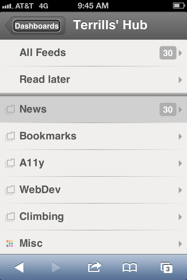
In contrast, NetVibes has implemented a heading structure that precisely matches my expectations as described above. Also, all icons have alt text and title attributes, and all lists of articles are coded with <ul>. This is very easy to use with a screen reader on the desktop, and even easier to use with VoiceOver on the iPhone.
Conclusion
This isn’t just another +1 for NetVibes. It’s a show-stopper for Protopage. Protopage is superior in several of the categories I care about, but I refuse to use a product that is completely inaccessible to users with disabilities, and you should too.
“But as a mouse user with eyesight, I don’t need an accessible product”, you might be saying. That may be true, but millions of other people worldwide don’t have perfect vision and can’t use a mouse. The decisions you make have an impact on the availability of accessible products for them. If every consumer demands accessible products, we’ll have nothing but accessible products.
The winner: NetVibes, the more accessible choice.
2 replies on “Choosing a Web Portal: NetVibes vs Protopage”
Thank you, TT, for the review of Protopage and NetVibes. I too need to set a new home page to replace iGoogle. Your conclusion about supporting the one which supports accessibility is a winning point to me, too. I have no physical or cognitive limitations, but my son does, and through him, as you may well imagine, I am acquainted with many more outstanding individuals for whom I am an advocate. I am about to go check out NetVibes.
Yet another vote for NetVibes: I was just contacted privately by a person who stumbled across this blog post and was desperately trying to figure out how to delete their Protopage account. Since I ultimately settled on Netvibes I find it ironic that someone would turn to me for Protopage support, but apparently they weren’t getting any replies from Protopage customer support.
In fact, I have no idea how to delete a Protopage account (mine is still active – I just don’t use it). However, if you’re the type of person who doesn’t like having a bunch of unused accounts lying around, potentially compromising your privacy or security, then NetVibes compares favorably on this need. It’s actually very easy to delete a NetVibes account, and clearly documented.