It’s December 2015, the one-year anniversary since Google introduced its NoCAPTCHA ReCAPTCHA in a Google Online Security Blog post. As Google explained then, “On websites using this new API, a significant number of users will be able to securely and easily verify they’re human without actually having to solve a CAPTCHA. Instead, with just a single click, they’ll confirm they are not a robot.”
The morning after Google’s announcement, Derek Featherstone was first to post an assessment of The accessibility of Google’s No CAPTCHA, and his initial response was one of “surprise, and maybe even a reserved delight.”
However, the response throughout the accessibility community was not all positive, as reported on Adrian Roselli’s blog post ReCAPTCHA Reboot, as well as in the comments on the WebAXE blog and posts to the WebAIM list.
In a nutshell, here’s how Google ReCAPTCHA works:
First, Google harnesses all sorts of information about the user and analyses that to determine whether it feels the user is human. If it can make that determination with confidence, it provides a CAPTCHA that consists of a simple checkbox with label “I’m not a robot.”

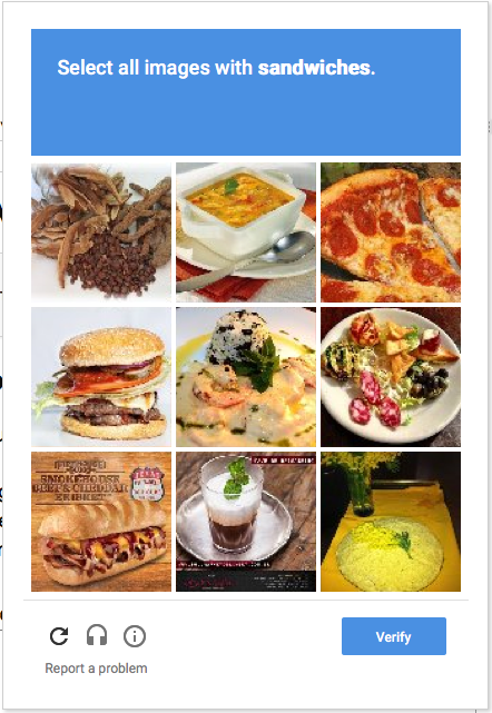
Next, if Google is not confident of the user’s humanness, it provides a more challenging CAPTCHA, such as the one shown here:

From my perspective, there’s no reason why the single checkbox should be inaccessible. In fact, it’s coded well for accessibility and it seems from my tests to work well with screen readers, speech input, and keyboard only.
However, things get more problematic if the secondary CAPTCHA is needed. But even here, I think Google has made significant improvement of this interface.
What is your experience? Please help me to collect data by filling out my ReCAPTCHA Test Form. I’m hoping to capture lots of data from the crowd and analyze the trends. I’ll share the results in a few weeks.
My Experience
Here’s an analysis of how ReCAPTCHA is coded, complemented with my experience using JAWS 17 in IE11. I also tested with NVDA 2015.4 in Firefox 42 and VoiceOver in Safari on both Mac OS X (El Capitan) and iOS 9, and get very similar results.
First, a simple checkbox
The simple CAPTCHA is delivered to the browser in a <div> which contains an <iframe> with title=”recaptcha widget”. The checkbox is a <span> but seems to have all the right markup for accessibility:
- role=”checkbox” and aria-checked=”false” (by default) enable assistive technologies to handle it as a checkbox
- tabindex=”0″ makes it keyboard-focusable
- the text “I’m not a robot” is explicitly associated with the checkbox via an aria-labelledby attribute
There is also an invisible <h1> at the top of the CAPTCHA with text “recaptcha status”, and beneath that a status message in a <span>, which is tagged as an ARIA live region (aria-live=”assertive” aria-atomic=”true”). This status message is updated repeatedly throughout my interaction with the CAPTCHA, and each time it’s updated the status is announced by JAWS.
When the checkbox has focus, JAWS announces “I’m not a robot checkbox not checked”.
Variations after checking the checkbox
I press space to check the checkbox. What happens next depends…
Variation #1: I’m verified.
If Google is confident that I’m human, the checkbox is decorated with a large green checkmark and the live region is updated with the text “You are verified”, which JAWS announces. Then I can press Tab to proceed to the next form field, which in most forms will be the Submit button.
Variation #2: CAPTCHA times out
If I take too long to respond, the live region text changes to “Verification expired. Check the checkbox again”. My focus is still on the checkbox (unless I’ve navigated elsewhere) so it’s easy enough to confirm my bearings and check the checkbox.
Variation #3: Secondary Challenges
If Google is not confident that I’m human, a secondary challenge appears in a pop-up (e.g., the sandwich picker shown above). This visual challenge is inherently inaccessible to people who can’t see it. However, there is a set of buttons at the bottom of the pop-up that includes a button for selecting an audio challenge. Note that the visual CAPTCHA isn’t just inaccessible to screen reader users: non-mousers with eyesight can’t access it either. As far as I can tell, there is no way to select one or more photos from the grid without using a mouse. However, the control buttons are keyboard-accessible, as is the audio challenge. I’m not sure why keyboard users would think to pursue that option, but it is technically accessible.
The set of control buttons is contained within a <div> with role=”region” and aria-label=”recaptcha controls”, and focus is placed on the first button in this region when the popup appears. JAWS announces “recaptcha controls region, get a new challenge button”.
If I press tab, I land on the second button, and JAWS announces “Get an audio challenge button”.
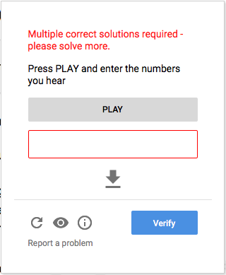
I press space, and the original visual challenge popup is replaced by an audio challenge popup. My focus is on the Play button, and JAWs simply announces “Play”. A more instructive label might be nice here, but I think this is fairly intuitive given my context within the workflow.
I press space to activate the play button. My focus is placed in the input text field, which has aria-label=”Enter the numbers you hear”, which JAWS announces as the audio begins playing. Sometimes JAWS collides with the audio, but to listen again I can shift+tab back to the play button and start over. The new audio challenges are actually much easier than they used to be (there are minimal competing background sounds).
The audio challenge is just numbers, and I enter them as I hear them, then press Enter when complete.
If the numbers I entered are wrong, or if Google is especially suspicious of my humanness, I might be asked to complete a second challenge, maybe even a third, fourth, and so on. Each time, a message appears in a <div> at the top of the audio challenge popup that says “Multiple correct solutions required – please solve more.” My focus is placed on that <div>, and JAWS announces its text.

I press tab, which takes me to the instruction text “Press PLAY and enter the numbers you hear”. I press Tab again, which takes me to the Play button, and I repeat the process from there.
Ultimate Success
If I’m ultimately successful at convincing Google of my humanness, I return to the original checkbox, which now says “I’m not a robot. Checkbox checked.” and the live region is updated with the text “You are verified”
NOTE that none of this works at all in IOS 8, where VoiceOver does not even recognize the simple checkbox. When right-flicking through each object on a page, VoiceOver simply skips the CAPTCHA. Setting the rotor to “Form fields” then down-flicking has the same result. This was apparently a bug that prevented form fields in an iframe from being recognized, not unique to ReCAPTCHA, and it has been fixed in iOS9. I confirmed the bug with iOS8 on an iPhone 6 and iPAD Air 2, and confirmed the fix after upgrading to iOS9 on both devices.
Conclusions
The experience described above isn’t terrible. Google has improved the markup significantly over the last year and it is possible for most users, including screen reader users, to successfully complete the CAPTCHA.
However, there are still problems:
- People who are deaf-blind cannot complete the secondary CAPTCHA. Neither the visual nor audio CAPTCHA is accessible to them. The only hope for them is if they never have to proceed beyond the simple checkbox. The checkbox itself is accessible.
- The secondary CAPTCHA is language and culture-specific. Take, for example, the visual CAPTCHA shown above which asks users to identify the sandwiches. Users must understand English well enough to understand the question, and they must be familiar with sandwiches. (And anyone who attended HighEdWeb 2015 knows that sandwich is not an indisputable concept).
- Keyboard users with eyesight can’t access the visual challenge. They can access the audio challenge, but how would they know to pursue that option? It’s not at all intuitive, plus visible keyboard focus is dubious.
I’m all for finding seamless solutions that don’t burden users at all, and on relatively small, low-traffic websites I’ve had success blocking bots using alternative techniques such as those recommended by Jared Smith, Craig Buckler, and many others (Google it).
However, my websites were all relatively small sites. I’ve heard second-hand from people responsible for much larger, high-traffic sites that these alternative solutions have limited effectiveness. Some sites are constantly under attack and CAPTCHAs successfully block millions of unwanted submissions. Admins of these sites are seriously challenged to find a more effective way of combatting this onslaught.
From my perspective, Google ReCAPTCHA is offering a step forward, particularly with improvements to the code that have been made over the last year. However, until we can completely be rid of the visual/audio CAPTCHA model, we’ll always be locking people out.
I’m excited though that the heart of what Google is doing here is improving the algorithm for detecting humans vs bots. What unique characteristics do humans have, and what behaviors do they exhibit, when they interact with online forms with or without assistive technologies? And how do those characteristics and behaviors distinguish them from bots? I personally think this is a solvable problem, and I’m excited that Google is working on it.

7 replies on “reCAPTCHA Accessibility reVISTED”
[…] reCAPTCHA Accessibility reVISTED | Terrill Thompson; 13 December 2015 at 5:21 pm. Permalink […]
I dunno if you view WebAIM posts but this is from a Dragon user:
“I have found Google’s new reCAPTCHA to be a 100% blocker for me these days. It is almost guaranteed to see Dragon NaturallySpeaking as a bot, which means it is almost guaranteed to give me the image verification screen, which means I am forced into the 100% non-keyboard accessible image verification process. I understand the problem with Dragon NaturallySpeaking being seen as a bot, but not putting keyboard accessibility onto the image verification screen is inexplicable.”
http://webaim.org/discussion/mail_thread?thread=7239
It also seems to see a security conscious TOR browser user as being a bot, which is a bit severe.
Great recap, thanks for putting this up.
One question worth asking, I believe, is how efficient it is, from a security point of view ? Especially compared to the previous version ?
Considering the obvious accessibility improvements, it would be great if we could exhibit proof of higher reliability, to motivate adoption. Are there any available data on this ?
First of all thanks for the interesting article!
I have just tested a German site that uses the new reCAPTCHA. With NVDA turned on, I found it repeatedly impossible to understand the beginning of the sound CAPTCHA due to the label of the form field being spoken at the same time. You mention this sound overlap, but personally I think you can include it as serious problem under ‘Conclusions’.
Thanks, Terrill, for the thorough evaluation. It seems like the interaction with the secondary test could be significantly improved by:
1. Enabling users to tab from picture to picture.
2. Rather than providing an audio alternative at the end of the popup, place it at the beginning so people can make the decision at the outset.
3. Better yet, once focus is on a picture, ask them to press the space bar if they would like to hear an audio description of the object, then if it is a valid image.
Thoughts?
Mike
I just tried this and was immediately verified upon checking the checkbox. But as I was typing in my comments about this test, VoiceOver prompted me that the CAPTCHA had expired and I would be given a new one. I never got an audio CAPTCHA here, so I guess I was successful? Or perhaps in part? In any case thank you for this.