The Webby Awards is the leading international award honoring excellence on the Internet. It’s been around since the late 1990’s, and each year about this time it announces this year’s nominees (to be announced on April 9 this year), followed soon after by the winners (on April 30 this year). As the gear up for the announcements, there’s typically much fanfare, and this year (today, in fact) they have announced a new website: The Webby Awards Gallery + Archive.
In their press release, David-Michel Davies, Executive Director of The Webby Awards, says this:
Over the past 16 years, Webby Winners have continually set the standard for excellence on the Web; they are the sites, innovations and world-changing platforms that have shaped the Internet into what it is today.
And what exactly is the Internet today? Is it fully accessible to everyone who has web-enabled technologies? Or is it racing ahead to be cool and clever, even if that means leaving entire groups of people behind?
There are occasional positive signs that designers and developers care about not discriminating against people who use audible or tactile interfaces rather than visual ones; or people who are physically unable to use a mouse and are instead operating computers by keyboard or voice; or people who are unable to hear audio.
These designers and developers try to build their innovations on a foundation of semantic, standards-based markup and make an honest effort not to leave a significant portion of the world’s population behind (more than 1 billion people worldwide have disabilities, according to the World Health Organization).
I would hope that The Webby Awards, in setting the standard for excellence on the Web, would also set a standard for accessibility. Unfortunately their new website exemplifies what’s bad about the Web. It embraces cool and clever at the expense of accessible and usable.
Shortly after Webby Awards began in the late 1990’s, the W3C Web Content Accessibility Guidelines (WCAG) 1.0 became an official W3C recommendation. After 15 years and exhaustive efforts from the W3C and countless others to educate the world about accessible web design, it is inexcusable for any website to not conform to at least to the basic principles of WCAG. When people create websites that completely ignore accessibility they are either (a) clueless about web design and development or (b) willing to discriminate against people with disabilities.
Here are my observations about the Webby Awards Gallery + Archive:
Color Contrast
The site features trendy gray-on-black menu items across the top and gray-on-gray informative icons across the bottom. Neither of these passes WCAG 2.0 color contrast standards at any level. WCAG 2.0 includes very specific measurable standards related to contrast, and there are many free tools out there for checking designs as they’re being created. The screen shot below shows The Paciello Group’s Colour Contrast Analyser for Windows and its assessment of the Webby Awards Gallery + Archive home page. This tool reports its results in a very easy to understand way: “Pass” or “Fail” on four measures (WCAG 2.0 Level AA or AAA conformance, normal sized text or large). In this case, the result is Fail on all measures.

Keyboard Navigation
Interestingly, one of the gray-on-gray informative icons at the bottom of the page is “Keyboard Navigation”, and shows four arrow keys:
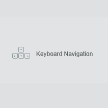
This is not a clickable icon, so this is the extent of the information that’s provided, and the arrow keys do in fact work to navigate through the Webby Award archives. One can navigate up and down through a vertical menu of categories (Year In Review, Special Achievement, Web, Online Film & Video, etc.). And one can navigate left and right through a horizontal slideshow of winners or nominees in that particular category. However, there’s a lot of content that doesn’t seem to be at all accessible without a mouse.
In addition to the vertical menu of categories, there’s also a vertical menu of years from 2012 back to 1998. There doesn’t seem to be any way to navigate that menu without a mouse, so non-mousers are stuck in 2012. Not much of an archive.
Also, many of the award entries have white on white icons that, if clicked with a mouse, allow users to visit the winner’s website, share via the usual social networking channels, or view project credits. I’m not finding any way at all to access these features with keyboard alone.

Captions on Videos
There’s a lot of video on this site, and I couldn’t find a single video that’s captioned. In fact, the media player that’s embedded into the Webby Awards Gallery + Archive application doesn’t even have a CC button or other control that would enable users to turn on captions if they existed.
Outside of this new feature of the Webby Awards site, the rest of the site is still using an embedded YouTube player so there’s at least hope of captions, thanks to Google’s Automatic Transcription feature. For example, we know that in the 16th Annual Webby Awards ceremony Brian Stelter of the New York Times said “reasonable with celery”…

And even more fitting, the host for the evening used the phrase “breaking bad usable”…

A Screen Reader User’s Worst Nightmare
The Webby Awards Gallery + Archive is one giant scripted web page, by default containing very little other than <div> elements. Without JavaScript, this is what users get:

This might be forgivable, since JavaScript is arguably an indispensable requirement for today’s Web. However, that alone isn’t the problem. Once the page is loaded and all those div’s are populated with content, the screen reader user discovers that it has 155 regions, 143 headings, and 187 links. And those 143 headings? They’re all <h1>.
If one is brave enough to drill into this nightmare of a page, they’ll find that most if not all of those 187 links go nowhere and have no appreciable effect if clicked. They’ll also find that other than those 143 headings, there really isn’t much content at all.
The State of the Web?
I’m picking on the Webby Awards here because I expect better of them, and because I’m frustrated. Unfortunately all the issues I’ve just pointed out are common on today’s Web, especially on sites that are heralded as “innovative”. What is it going to take to finally turn that around?
One huge leap forward would be if sites that are highly visible leaders in the online space, like The Webby Awards, would embrace accessibility, develop a fully accessible new website, and boast as proudly about being inclusive as they do about being cool and clever. And while they’re at it, it would be great to see an “Accessibility” award category, showcasing sites that have made challenging applications accessible to a full spectrum of possible users. What do you say, Webby Awards? Can the more than 1 billion people with disabilities in the world look forward with excitement to the new site you’ll be unveiling in 2014?
3 replies on “The Webby Awards Unveils Exciting New Inaccessible Website”
Well said!
I can’t believe that Webby awards, that is such an institution go so far away from user experience that they exclude people to do a cool website. I think that they could have kept many of the elements but still make it accessible to everyone.
I absolutely believe it. I’ve never actually been all that impressed with the Webby Awards; whatever their standards are for excellence, they seem to be different from mine. Whatever. I live in the practical, workhorse world where form is great and aesthetics do matter, but not at the sacrifice of function.
Most of my clients are musicians, and amazingly enough, a lot of blind (and mobility-impaired) folks like music a lot, so I make sure our websites don’t leave them out in the cold. I don’t think anyone thinks my musicians (some of whom were on the Grammys this year) are any less cool for it.
I like Wil Wheaton’s #1 rule for living: Don’t be a dick. Yes, hello, Webbys. I’m looking at you.