I’m writing this blog post for at least three reasons:
- I’m often asked whether Doodle is accessible to screen reader users.
- I’m often a participant in meetings that (a) are scheduled via Doodle, and (b) include blind participants.
- I think Doodle’s approach to making their interface accessible raises some interesting questions.
First, in case anyone is unaware, Doodle is a free website where people can compare available dates and times for meeting, without everyone having to share the same calendaring system.
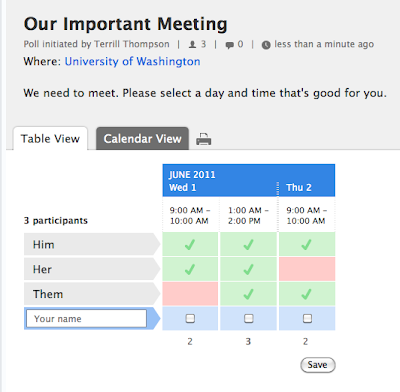
The main interface is a table, where each row represents a participant and each column represents a particular meeting time on a particular date. Hey – what I just said could be included in a summary attribute on the <table> element, but Doodle instead is using the title of the meeting as the value of its summary attribute (in my example, summary=”Our important meeting”).
The table is also lacking key markup that is typically recommended for making HTML tables accessible. All of the column headers are marked up with <th> as they should be. However, there is no scope or id attribute on these <th> elements, nor is there a headers attribute on any of the <td> elements. This markup helps to ensure that screen readers correctly identify the relationships between all the tables’ parts (for example, which headers go with which cells). For methods and techniques, WebAIM has authored an excellent tutorial on Creating Accessible Data Tables.
If a table includes accessible markup, screen readers will typically announce the new row or column headers as the user navigates into a new row or column. Screen readers typically don’t announce this information for every cell, because if the user hasn’t changed rows or columns they probably know where they are. If they need to be reminded, they can request this information from their screen reader with a keystroke or two.
Since Doodle doesn’t include any of the HTML markup for explicitly associating headers with data cells, there’s no guarantee that screen readers will correctly identify those relationships. However, I don’t think that was an oversight on Doodle’s part – I think it was a conscious decision. Here’s why:
Doodle’s table contains a form. Forms, like tables, have their own accessibility requirements. The most common and critical requirement is that all form fields should have <label> elements. For sighted users, labels are usually obvious. If there is a text prompt, it’s usually positioned near the field so sighted users understand that it accompanies the field. If there are no text prompts, that’s usually because there are other visual cues that make it obvious what a form field is for. However, blind users don’t have access to those visual cues so form fields need <label> elements that are explicitly connected to the fields they represent.
Each checkboxes in the Doodle form has a <label> element that includes the full date and time (e.g., "Wednesday, June 1, 2011 9:00 AM – 10:00 AM"). They labels are positioned off-screen using Cascading Style Sheets (display:block; position:absolute; top: -999em) so they aren’t visible to sighted users, but screen readers still read them. With so much detail in these labels, the user is absolutely certain of which dates and times they’re checking, even though the accessible table markup is missing.
If a screen reader user wants to check and see who else among the invitees is available at particular times, they can do that too. Each table cell is filled bestacnedrug.com with an image (a green checkbox signifying available, or an empty pink box signifying not available). Each of these images has an alt attribute that includes the name of the person, the date and time, and a one-word declaration of their availability (Yes or No), like this: alt="Jane Shmoe, Thursday, June 2, 2011 9:00 AM – 10:00 AM: No."
So to summarize, every cell in the table contains all the information a user could possibly need, using either alternate text on an image, or a hidden label on a form field. This approach makes row and column headers irrelevant.
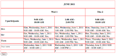
I reserve judgment on whether this is the best approach. The biggest problem I see is that perhaps there’s too much information. Users have to listen to far more detail than they would if accessible table markup was applied in conjunction with less detailed alternative content in each cell. To give sighted users a sense of how cumbersome this might be, here’s the same table with CSS and images both turned off:
Imagine having to listen to all that information. On the other hand, the comparatively verbose approach that Doodle is taking is more precise. There’s no requirement for users to piece together information from multiple sources (e.g., headings and labels or headings and alt). Maybe this is better for users who are less skilled with their screen readers. Any opinions? Please comment.
Doodle Mobile
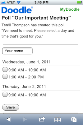
Another option for screen reader users is to use the mobile version. If a user requests a Doodle URL via a mobile web browser, they are automatically redirected to the mobile version, which is ultra clean and simple. It’s just a form with checkboxes:
Unfortunately Doodle neglected to add accessible markup to the mobile version (most notably, <label> elements are missing). However, from my tests it seems to work fine with VoiceOver on the iPhone, as well as with JAWS if a user opens the mobile version in a non-mobile Windows browser.
The mobile version doesn’t allow users to see which dates and times other participants have selected, but some users might happily sacrifice that for the comparatively simple interface.
The mobile version can be accessed in a non-mobile browser at m.doodle.com. However, it’s not as easy as you might think to convert a Doodle URL to its mobile version. To do that, you need to add “mobile/participation.html?pollid=” to the URL, after the top-level domain and before the Doodle ID. For example, let’s say somebody sent you a Doodle link like this one:
Here’s where you’ll find the mobile version:
Did you say Doodle’s table has a summary attribute?
Why yes, I did. As implemented, it doesn’t provide a summary of the purpose and structure of the table, which is what the summary attribute was designed for. However, it could very easily be improved with something like this:
This summary can help screen reader users to know what to expect as they enter the table, and sighted users don’t need that information. Unfortunately, the summary attribute has been dropped from the HTML5 specification, and HTML5 is about to go into "Last Call". But that’s a topic for another day…


10 replies on “Forms within Tables: Doodle and Accessibility”
I did a quick test of the demo at http://www.doodle.com/BSPgbdhp5hyyzn78 in VoiceOver, JAWS, and NVDA and it was quite accessible. I'm convinced that the experience would be nearly perfect if they had not used th at all. The existing headers cause some repetition when reading through the table. This is especially true in NVDA due to its very strict interpretation of table headers – it reads all headers and cell contents for each cell. VO was an exceptional experience due to its limited support for table headers – only the month and year were repeated in some cells.
In general, I got just the information I needed at the right times. The use of title is useful for sighted users and the alternative text for the Yes/No images and off-screen labels for the form controls seemed to work great. The summary isn't particularly helpful, but isn't worthless either. I don't know that your very verbose summary is really necessary as it was quite intuitive without it.
I'd only make a few changes:
– Probably remove all th's from column headers. The necessary data is in each cell without it. This seems very wrong, but the repetition they cause makes the experience worse.
– Fix the label on the text box where you enter your name. Its label is currently empty, but has a title attribute value that is not read.
We had a table that both showed statically prices and availability of houses for rent, and that same table but with a form inside for homeowners to fill in themselves.
While initially I had had a bunch of headers/axis/scope on my table (since the static pure table had them), I found all my readers really only cared about the form. So the form needed to be standalone and many table attributes like headers were ignored: so, couldn't rely on headers attribute reading out the "label" of the TH when the user was on the input. Initially I went with titles on the inputs (worked great for JAWS and NVDA); if I were to write it again though I'd use off-screen labels. Orca is one screen reader who won't always necessarily read out titles, so to me that meant titles weren't safe enough (I'm a Linux user myself).
Re the Doodle availability alt… it would be nice to have a short version (Joe: no, wed) and then longer if accessed, but not sure how one would build that.
@Jared Smith: I had a table with long-named THs, and tried out abbr attribute. If that reduced the th's to "Wed" etc would it then still be best to leave them THs?
I agree with you @Jared that removing the TH elements would actually benefit accessibility. It's good to know the rules, but once you know them it's good to know when to break them.
@Stomme I'm inclined to stick with that thinking (remove the TH elements) regardless of whether their content is abbreviated. It's still redundant if you have all the information the user needs elsewhere in the form. Thanks by the way for bringing Orca into the conversation. Linux is too often ignored when talking about accessible web design – we need to change that.
Hi Terrill,
Thank you very much for this excellent article. We are very happy to see that someone outside looked into our accessibility implementation. With our recent redesign, we invested quite some time to make Doodle for Blind people accessible. We worked with a consultant from http://www.access-for-all.ch/ on improving it. What we learned is, that there is no one perfect solution. We hope to have it implemented in a way it works for the most.
We currently work on a redesign for our Mobile Doodle version. We plan to do the same efforts there to make it accessible.
Best regards,
Reto
VP Product Management at Doodle.com
Great writeup Terry!
Instead of relying on off-screen labels, another option is to use aria-labelledby. That way each input element can be labelled by various on-screen elements, in this case the existing th elements. The end result is the same as using the off-screen labels, but to me there is something a little more tidy about using the existing elements on the page that are already visually functioning as labels. Here is a sample I made using aria-labelledby to make date entries more accessible that accomplishes a similar goal – having multiple labels for a single input element.
http://accessibility.oit.ncsu.edu/blog/2011/06/22/accessible-date-input-and-more-using-aria-labelledby/
and
http://accessibility.oit.ncsu.edu/training/forms/multiple-inputs.html
The same technique could be applied to this table of input elements too, just assigning the aria-labelled by to the appropriate table "headers".
In terms of using the table, my experience is that one you are in forms mode the table markup is irrelevant. They are simply using the table for layout purposes because it's significantly easier to achieve the desired layout with an actual table rather than pure CSS.
Good article Terrill! I'll reference it if thats ok. Cheers Josh
Hi Josh. Thanks for the feedback, and sure – feel free to reference it.
I just found a new wrinkle: My office colleague sent out a poll yesterday that included the “Ifneedbe” option (this can be turned on in the poll creation wizard).
The resulting poll then has 3 options rather than two. So instead of a checkbox to indicate simple yes/no availability, each item now has 3 links for choices.
Working with Jaws 13 in both IE & Firefox, pressing enter or space on the choices doesn’t produce any effect. Perhaps the choices are changing color or something, but they remain “visible” to the screenreader. I have no indication of which choice I have selected.
Bottom line: 2-choice polls = accessible; 3-choice polls not working at all. BIZARRE!
Has anyone else encountered these if-need-be (“ifneedbe”, as they write it) polls? Anything that I’m missing that would explain it?
Appears to me that the form would need to be redone with 3-item radio buttons. …
Thanks Terry!
Hey @Patrick, this is the first time I’ve seen the “ifneedbe” option, but you’re right – it’s definitely unconventional and consequently inaccessible. There are now three options (“Yes”, “(Yes)”, and “No”). That alone is pretty unintuitive for all users I think – the parenthetical “(Yes)” is the conditional yes option (“ifneedbe”). These are all coded as links (anchor tags) so they’re part of the tab order, but as you mentioned when you select one there’s no obvious indication that you’ve selected it. Visibly, the link you’ve selected is underlined, but nothing changes at the code level that would provide needed feedback to a screen reader user.
You can only select one of these three options for a given time slot, so they links are behaving like radio buttons. It isn’t clear to me why they aren’t just using radio buttons. If that for some reason isn’t feasible, they could improve on the accessibility of the current design by using ARIA to communicate role (role=”radiogroup” and “radio”) and state (aria-checked=”true” or “false”). But there’s ARIA at all in the current design.
For the record, this isn’t accessible to keyboard users with eyesight either. It’s possible to tab through the options, and press Enter to select an option, but there’s no visible indication of focus, so there’s no way to tell which item you’re on without arbitrarily selecting items and doing a lot of guesswork.
Thanks, Terrill, for this article on table/form accessibility. I’m currently working on improving the accessibility of the University of Washington’s online application and I think I will go with the approach of using offscreen labels with all of the details in the hidden label. Based on other comments here, it sounds like the consensus is to also change th elements into td elements to avoid the screen reader from being too repetitive when shifting focus between the different form fields and table cells.