First, I should disclose my bias: I just turned 51, no longer have 20/20 vision, and prefer text that is readable rather than text that makes me squint.
Don’t make users squint
Font size in CSS can be specified in any of several size units, the most common of which are pixels (px), em, or %. The differences are clearly explained in Kyle Schaeffer’s article CSS Font-Size: em vs. px vs. pt vs. percent.
In his 2006 article The 100% Easy-2-Read Standard, Oliver Reichenstein argued convincingly for using a font-size of 100%, which is the text size browsers use by default.
In 2011 D Bnonn Tennant’s Smashing Magazine article 16 Pixels: For Body Copy. Anything Less Is A Costly Mistake expanded on Reichenstein’s article and argued for using fonts that are at least 16 pixels, which is the default size in most browsers.
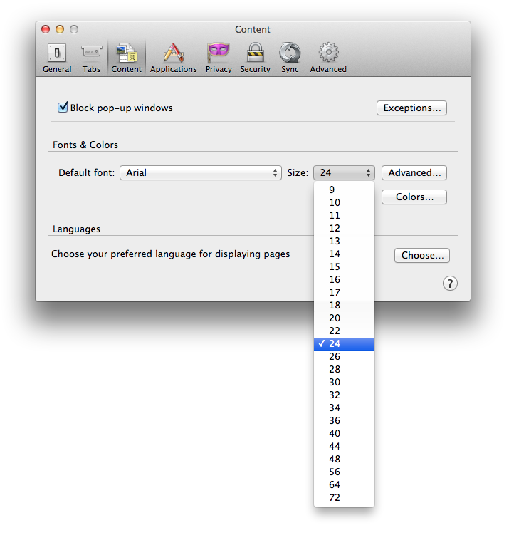
I don’t know this for sure, but I like to believe that browser makers at some point in their histories did extensive usability testing to determine the optimum font size to use as their factory default setting. So I agree with Tennant that web pages should honor that standard. But there’s a fundamental difference in Tennant’s and Reichenstein’s recommendations. Tennant is recommending 16 pixels, whereas Reichenstein is recommending 100%. For many users, these two units are the same since 16 pixels is the browser default. However, some people change the default font size in their browser. It’s easy to do, right there in Preferences where folks can change all sorts of things like their browser’s start page and whether to block pop-up windows. The screen shot below shows the Preferences dialog in Firefox, where users can select any of an impressive range of font size options, from 9 pixels to 72.
When users change their browser’s default font size, either larger or smaller, it’s because 16 pixels is not the optimum size for that person. They have a personal need or preference for text in a different size.
Relative font sizes still matter
Accessibility evangelists have long advocated for using em or %, as these are relative font sizes, which scale up or down with the browser’s default font size. Font sizes defined using pixels don’t do that. Many of the comments on Schaeffer’s post suggest that accessibility-conscious designers were concerned about avoiding pixels back in the Internet Explorer 6 era, when zooming in IE meant changing text size only. Starting with version 7, IE has provided a zoom feature that allows users to enlarge the full page without repurposing it, thereby preserving the layout. Other browsers were already doing this, so once IE joined the crowd it became possible to enlarge any web page, even those coded in pixels.
However, it’s still possible to zoom text only. IE11 still provides this feature (View > Text Size; options range from “Smallest” to “Largest”), as does Firefox (View > Zoom > Zoom Text Only). I personally know many people who prefer enlarging the text only, as enlarging the entire page often requires horizontal scrolling which impedes reading. And when you zoom text only, IE11 still enlarges only that text that’s styled using em and %. The text that’s styled using pixels remains unchanged.
Also, text styled in pixels does not change when users change their preferred font size in their browser.
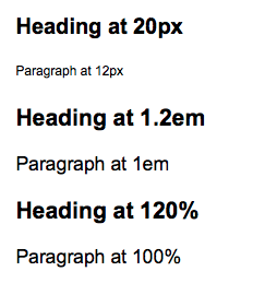
Below is a screen shot of a test page that I created, showing examples of various font size values. The first example shows the page as viewed in Firefox using the browser’s default font size (16 pixels). Note the size of the content that’s styled at 1em or 100%—that’s the default font size. Compare that to the content that’s styled at 12 pixels: The latter is considerably smaller than the default.

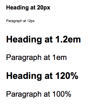
Now consider the person for whom 16 pixels isn’t large enough, like myself. Let’s say I select 24 pixels as my preferred browser font size. When I view the same test page, the content that’s styled at 1em or 100% is larger as expected, which makes me a happy user. However, the content that’s styled at 12 pixels hasn’t changed at all. It’s still tiny, and seems especially tiny since I require a larger font.

Users have the option of overriding the designer’s specified font size, but that’s extra steps. In Firefox, it’s incredibly easy to change the default font size, but to override the web page styles I have to go into the “Advanced” settings, and many users won’t do that. In other browsers it’s even more difficult, if not impossible.
WCAG 2.0 Requirements
Sometimes when I recommend using font-size of 1em or 100%, I’m asked “Is that required by WCAG 2.0?”
Well, not exactly. WCAG 2.0 Success Criterion 1.4.4 “Resize text” calls for text that can be “resized without assistive technology up to 200 percent without loss of content or functionality.” That’s a Level AA success criterion. There are several possible techniques for meeting this success criterion, including using percent for font sizes and using em for font sizes. But neither of these techniques requires a specific minimum value (i.e., 100% or 1em). Lots of websites set their base font size to a fraction of the default, like say 50%, which results in microscopic text. But some of these same sites claim to be 100% accessible because they’re using relative size units rather than pixels.
The thinking is that if users can’t see the text, they can zoom in with the browser’s built-in full-page zoom functionality, which is a valid point. However, as mentioned above full-page zoom requires horizontal scrolling which is not ideal. Plus, I’m reasonably sure that some users, perhaps even many users, don’t know their browser’s keystrokes for zooming. If designers feel that it’s ok to require users to zoom in to see their content, then they should be equally ok with requiring perfect-sighted users to zoom out. One group needs larger text, while the other group prefers smaller text, and in my view need trumps preference.
Even if font-size:100% or font-size:1em isn’t required by WCAG 2.0, does that really matter? Is WCAG compliance the only reason we make design decisions? This isn’t about compliance, it’s about respect.
Respect your users
As a designer, you have no idea what font size your users have set in their browser preferences. If your base font is styled using pixels, even if you opt for a relatively large font like, say, 18 pixels, you don’t really know whether that’s larger or smaller than the user’s default. And if you use em or % to define your base font to a size that’s smaller than 100%, that’s like saying “I’m the designer, and I think your default font size is too big so I’m going to give you something smaller.” I find that disrespectful. It’s placing your design above users’ needs and preferences.
Creating a design that is flexible and works well for all users, regardless of their font size preferences, can be challenging. But in my opinion that’s the true mark of a good design. Default font size in the user’s browser is a preference, and setting font size to 1em or 100% respects that preference.
